


Playground Pros E-Learning Platform for Coaches.
Playground Pros E-Learning Platform for Coaches.
Playground Pros E-Learning Platform for Coaches.
Playground Pros
E-Learning Platform for Coaches.
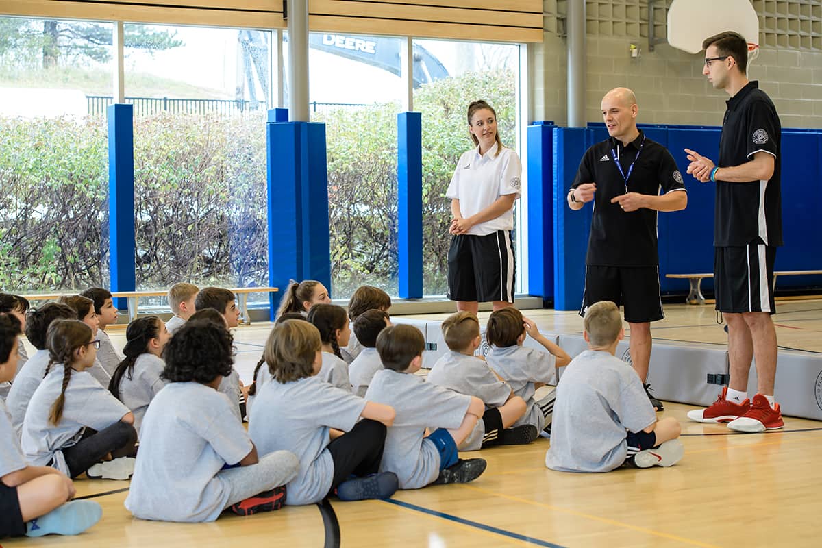
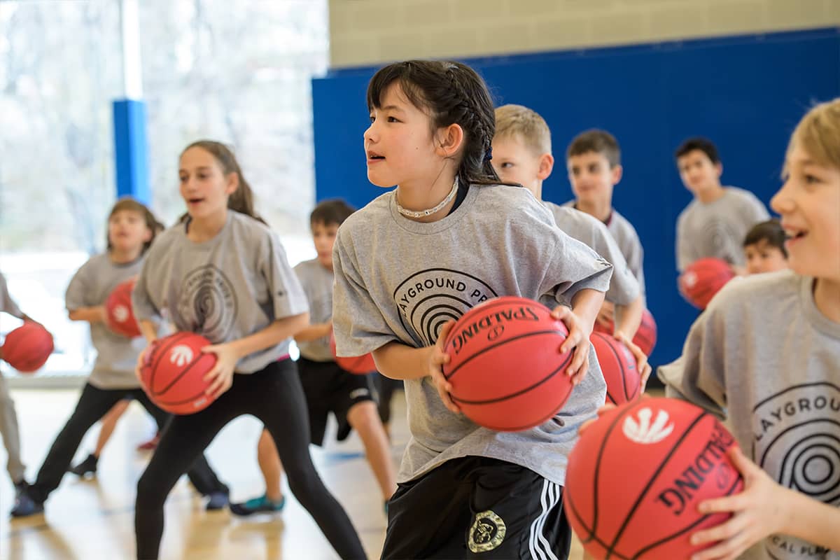
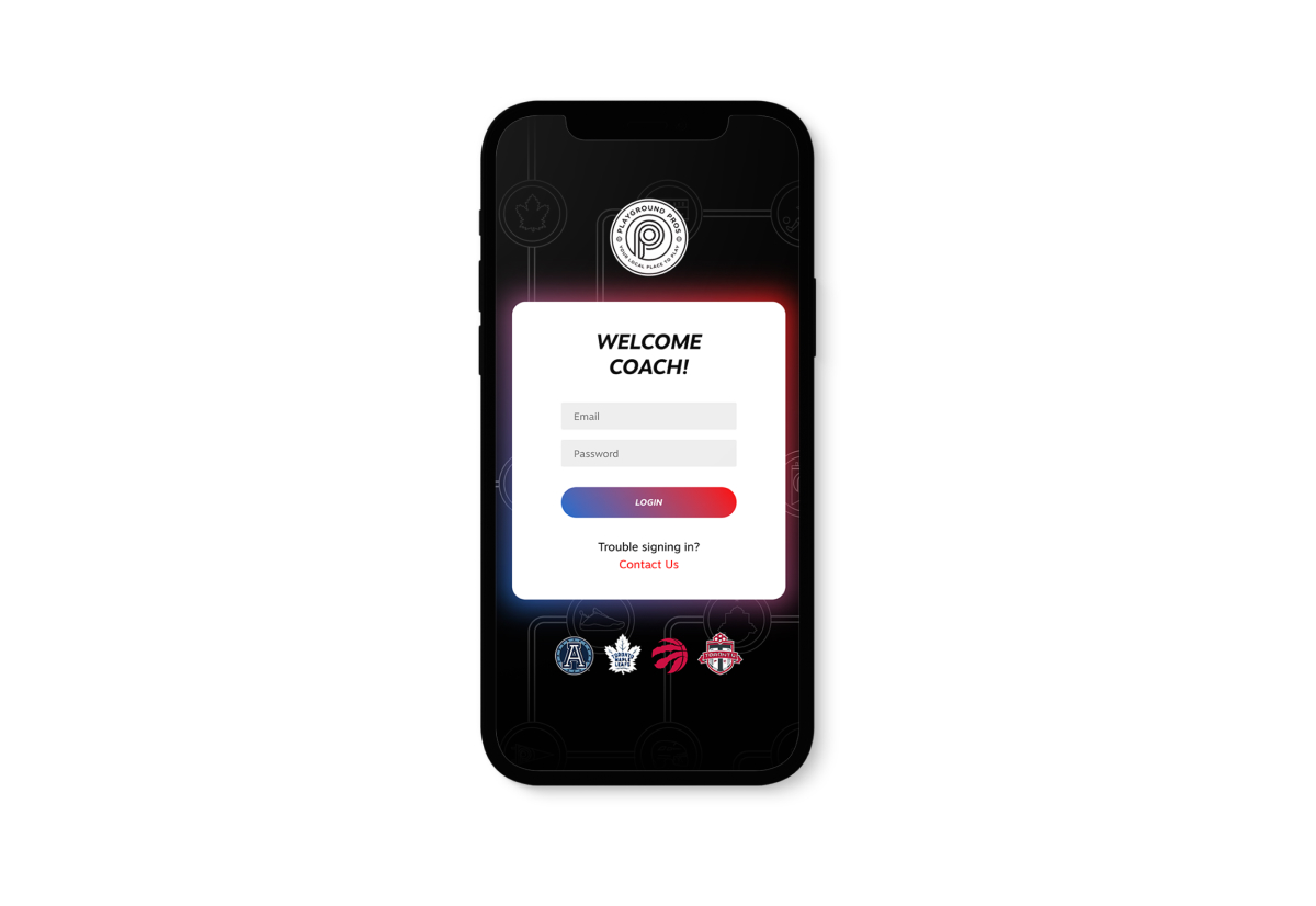
Playground Pros is the official multi-sport summer camp of the Toronto Raptors, Maple Leafs, Toronto FC, and Toronto Argos. The pandemic changed the way Playground Pros would train and onboard their summer camp coaches. They approached me to design a build a custom e-learning web product for them to operate and manage.
Project duration: 12 Weeks
PROJECT BASICS
THE PROBLEM
During the Covid-19 pandemic, it was difficult to train and onboard newly hired summer camp coaches. Training courses and lessons were in PDF or printed format and there wasn’t an easy way for Playground Pros to track the learning progress of their newly hired coaches.
THE GOAL
Design and build an e-learning web product for Playground Pros to facilitate training programs, quizzes, and manage the progression of their newly hired coaches.
RESPONSIBILITIES
Conducting interviews to gather relevant information, digital wireframing, low and high-fidelity prototyping, accounting for accessibility, iterating on designs and responsive design, web development and technology implementation.
RESEARCH
Understanding the user
1. USER RESEARCH SUMMARY:
I conducted user interviews with program co-ordinators and coaches with experience running their onboarding process, which I then turned into empathy maps to better understand their target users and their needs. I discovered that coaches entering this program are typically fast learners and self-motivated, but may not be experienced with e-learning websites. The feedback received through the research made it clear that coaches would be more than willing to participate in an e-learning program as long as its an easy-to-use website that allows them to complete their courses and lessons on their own time.
Name/Age: Greg, 27
Education: McGill University
Location: Toronto, Ontario
Occupation: Soccer Coach
2. PERSONA: GREG
Problem statement: Greg was recently hired to be a camp coach at Playground Pros but needs to complete the initial training courses as part of his onboarding process. He is motivated to complete his courses and start his journey as a coach with MLSE/Playground Pros.
With the new safety guidelines and restrictions in place, Greg is unable to meet anyone in person to receive his training. He will need to complete his courses online, which can present some challenges. Greg has a busy schedule will require multiple sessions at his own pace to complete the training programs.
Goals:
- He wants to feel connected to the coaching community at Playground Pros
- He want to complete the courses on his own pace and schedule
Frustrations:
- Large multi-page PDF documents are overwhelming to digest and learn
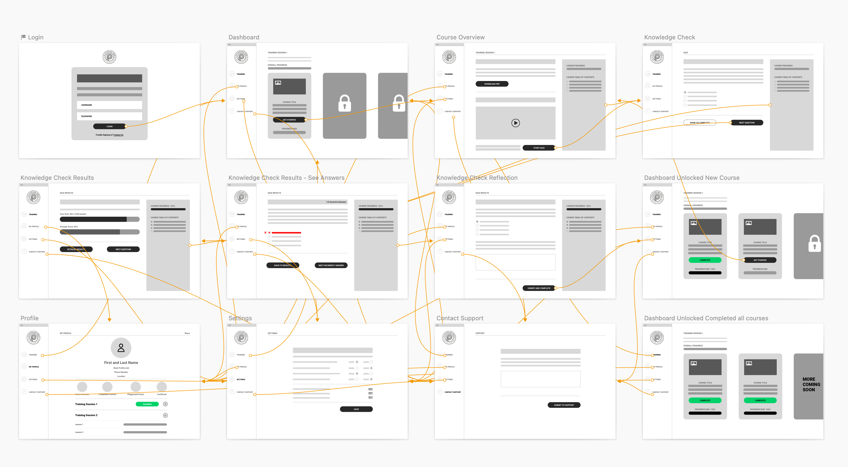
3. USER JOURNEY FLOW
I created a user journey map of Greg's experience using the e-learning website to help identify possible pain points and improvement opportunities.

PROTOTYPING
Starting the design
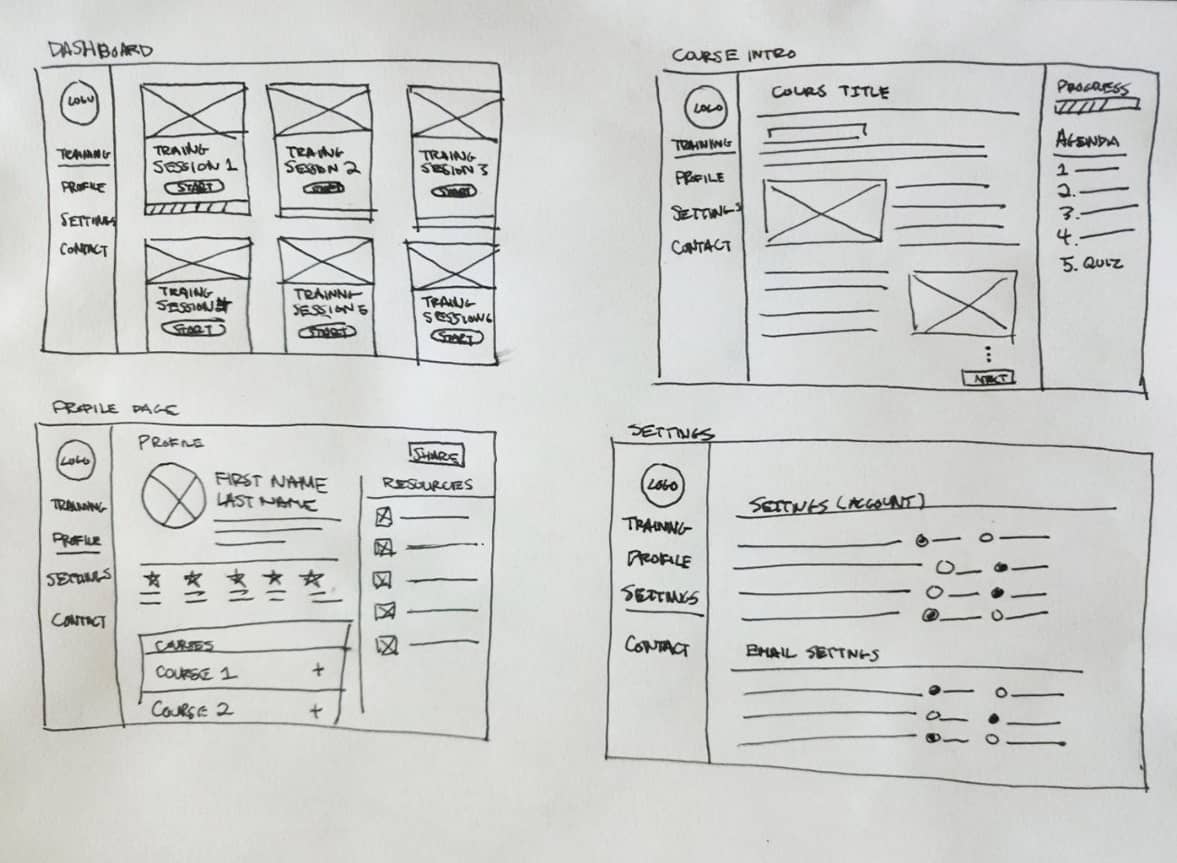
1. PAPER WIREFRAMES:
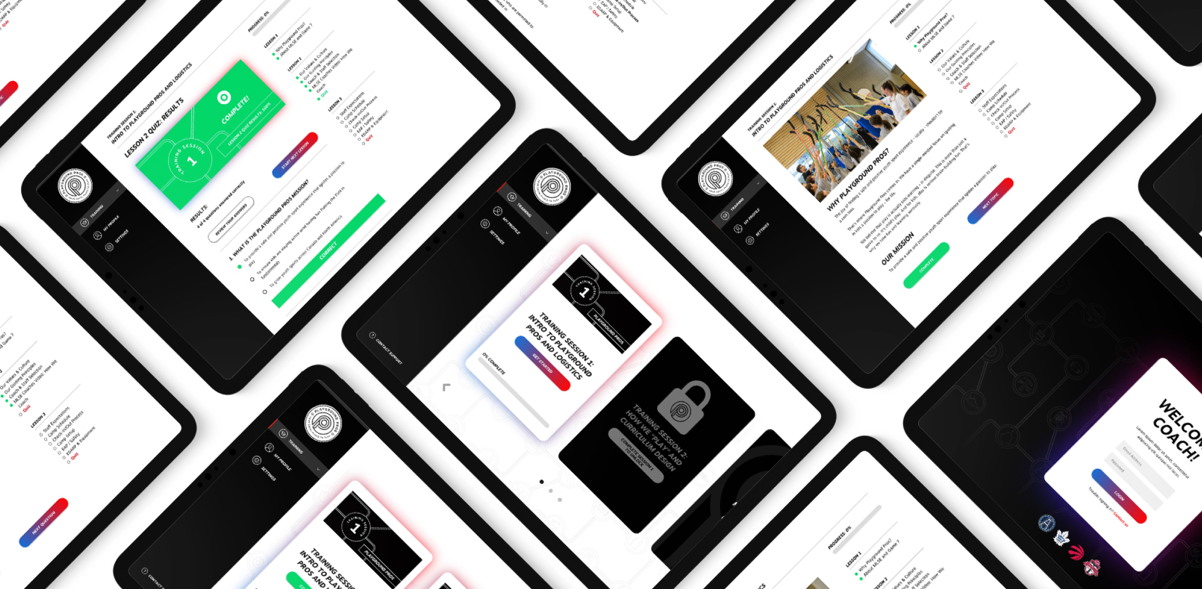
To start, I sketched out paper wireframes for each major screen, keeping the user's pain points about navigation, heavy-reading, and intuitive course flow in mind. The home screen paper wireframe variations focus on optimizing the course experience for learners.
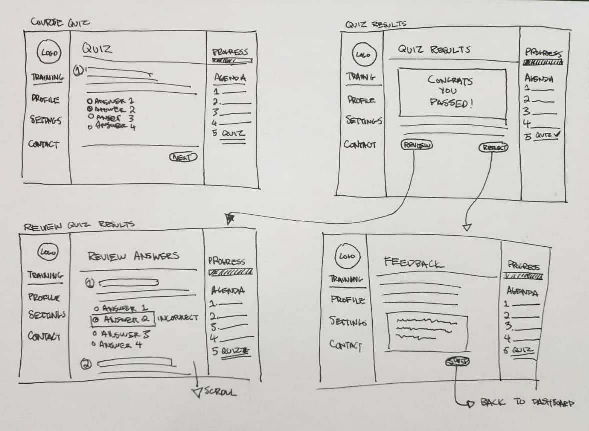
2. DIGITAL WIREFRAMES:
Moving from paper to digital wireframes made it easy to understand how the design could help address user pain points and improve the user experience. Prioritizing useful button locations and visual element placement on dasboard and course pages was a key part of my strategy.
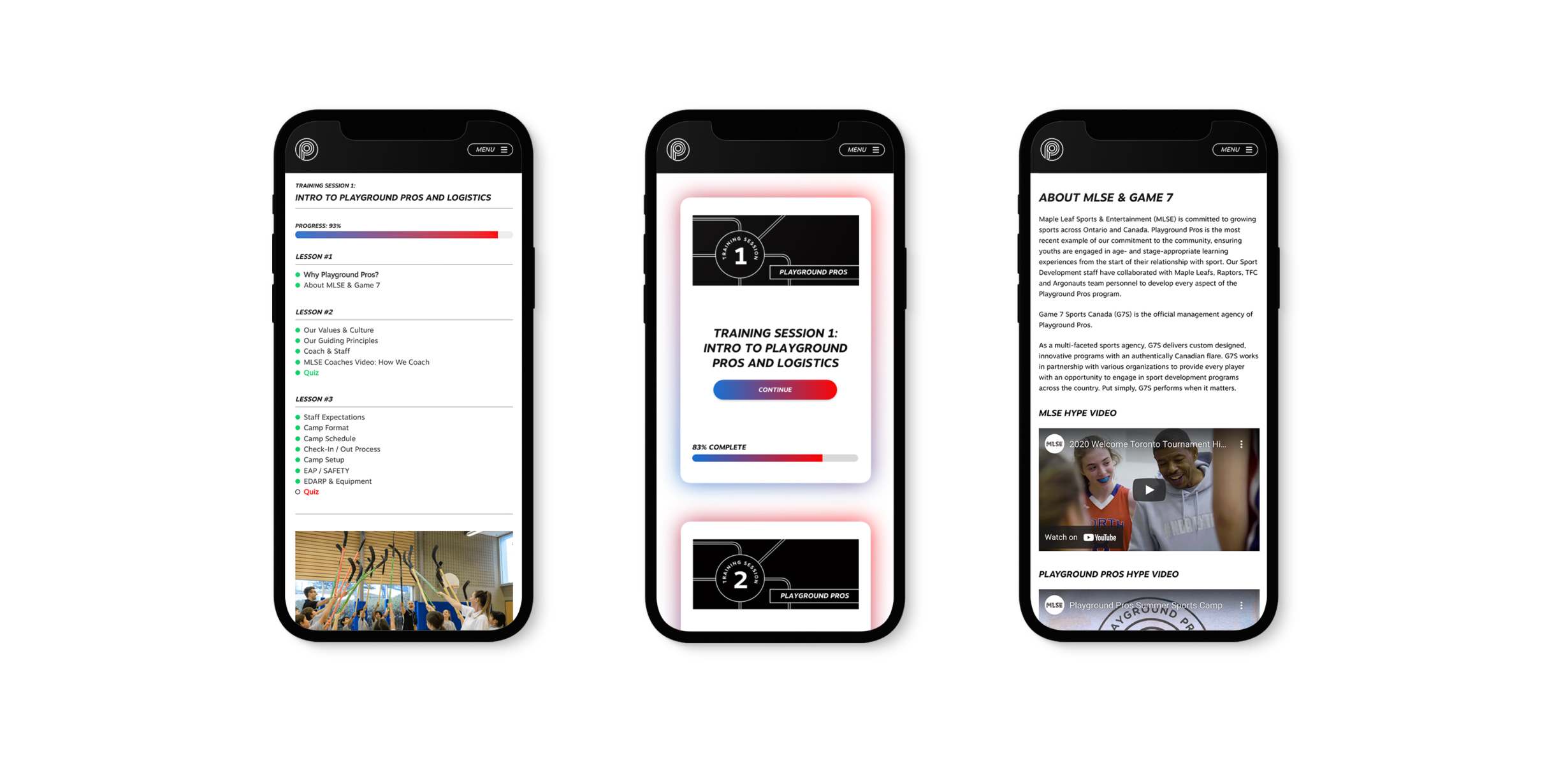
E-Learners might also access the site on a variety of different devices and I created designs for additional screen sizes to make sure the site would be fully responsive.
3. LOW-FIDELITY PROTOTYPING:
To prepare for usability testing, I created a low-fidelity prototype of e-learning dashboard from the perspective of a brand new coach that has just logged in for the first time.
4. USABILITY STUDY: FINDINGS
To prepare for testing, I used the prototype to conduct an unmoderated usability study with 5 participants. Here are the main findings uncovered by the usability study:
A) Confusion with multiple progress bars on dashboard
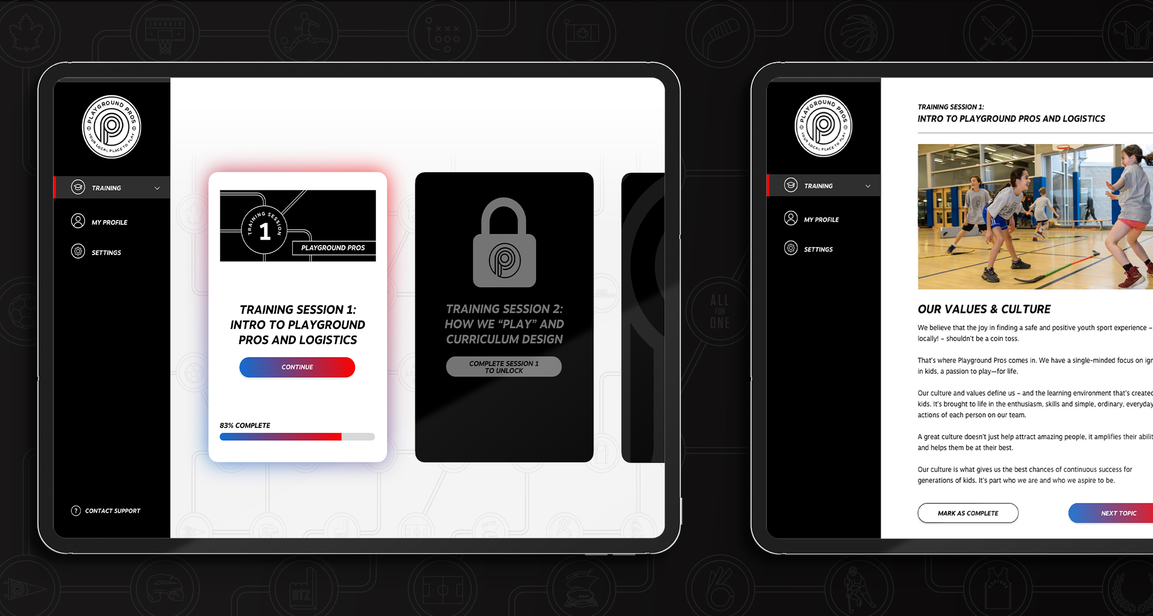
Solution: I removed the overall progression bar from the top of the dashboard and contained it within each course instead. This improved the visual hierarchy of the dashboard.
B) Courses/Lessons are overwhelming when certain pages scroll for too long
Solution: We created the inclusion of “topics”; a sub-category that is nested inside each lesson. I added a secondary navigation that visually guides you through each topic within the lesson and as a result, reduced the scrolling significantly.
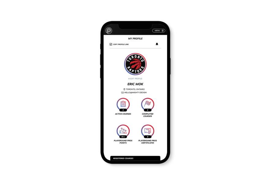
C) Coach profile page lacked shareability
Solution: I added some visual displays of course completion badges and "Playground Pros Points" stats under the coach profile to encourage a little friendly competition between coaches.
HIGH-FIDELITY DESIGN
Refining the design
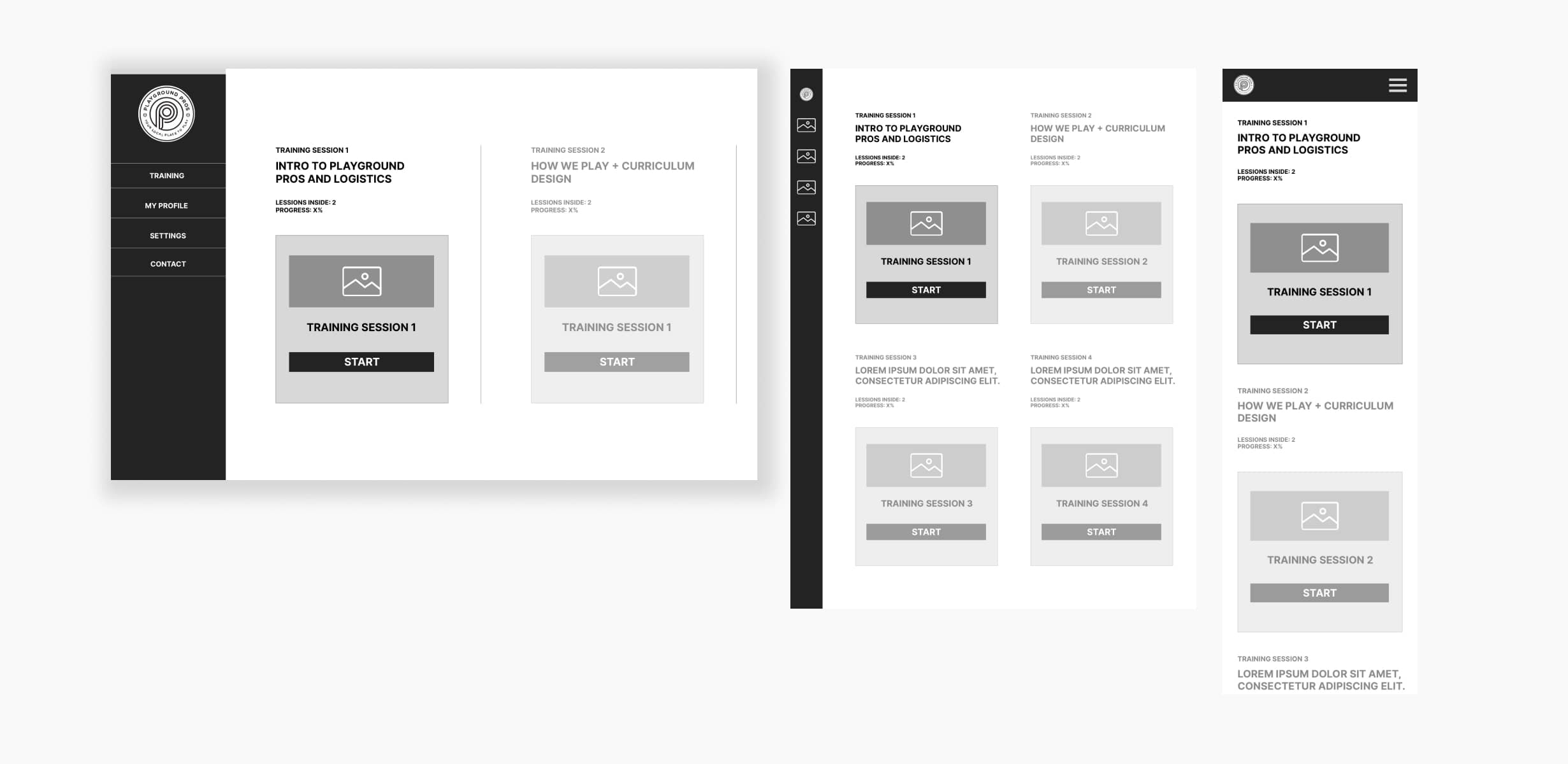
1. MOCKUPS:
Based on the insights from the usability study, I made changes to improve the site’s overall experience.
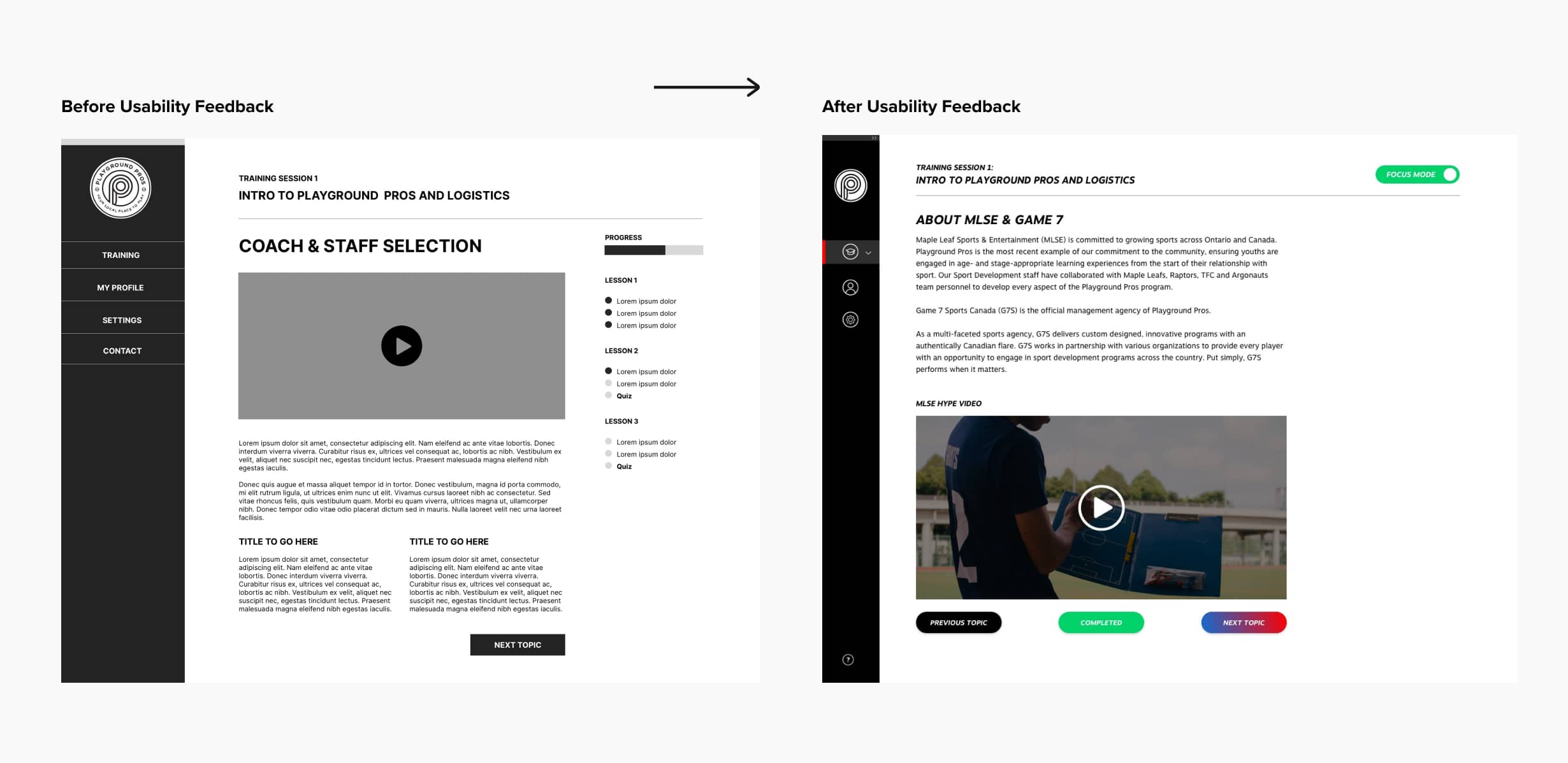
I also added a "Focus Mode" button within the course that collapses the primary and secondary navigation menus, leaving only the course content in view. This gave the learners a cleaner view of their course material as a result.
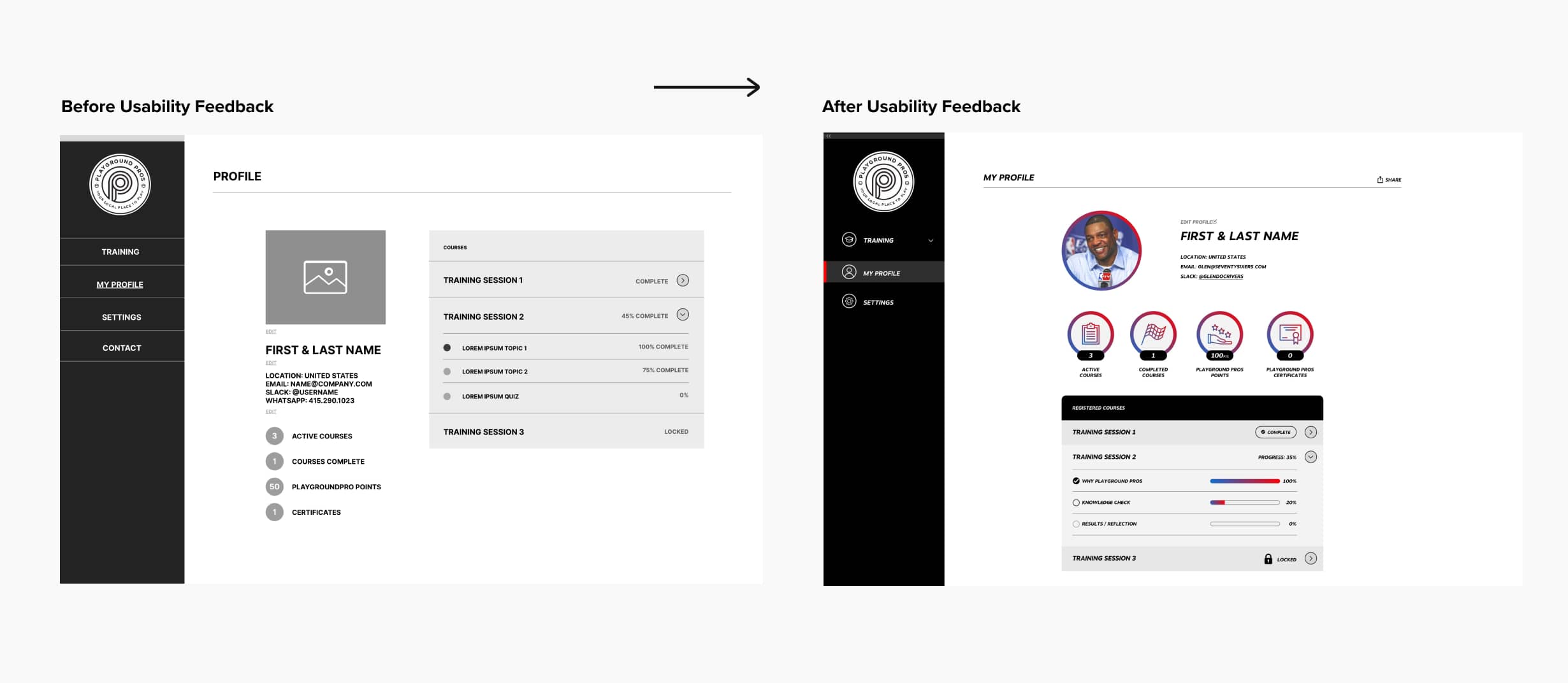
Another change I made was adding more visual emphasis on the badges within the profile page. This made it the primary focus point on the page, and something learners can look forward to seeing updated.
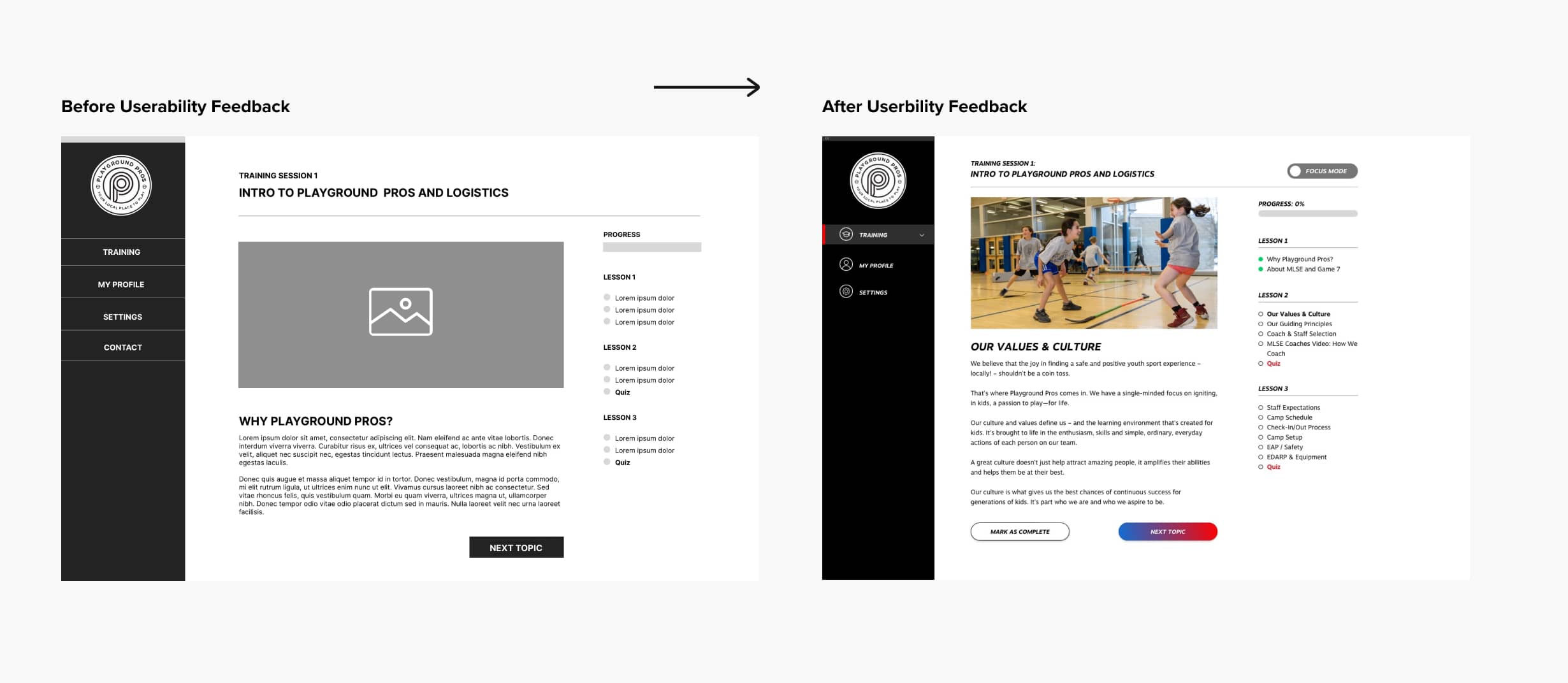
A small change that I made was adding a "mark to complete" button inside each topic page however, this had a big impact on the user experience because it effectively allowed users to save their spot inside a course/lesson and come back to it at a later time. Prior to this design change, there wasn't an easy way for users to save their progress within topics.


2. ACCESSIBILITY CONSIDERATIONS
A) I used headings with contrasting size of text for clear visual hierarchy
B) I used high contrast rate for the colours
C) Widescreens will not experience large widths of paragraphs for legibility purposes
STYLE GUIDE

MOBILE DESIGN
Responsive Design
With the desktop designs complete, I started working on designing the responsive/mobile version of the website. Most users will be using desktop to start but may use their mobile to continue their progress on the go. I used a sitemap to guide the organizational structure of each screen’s design in order to have consistency in the overall experience across devices.

TECHNOLOGY
How we built this product
CONTENT MANAGEMENT SYSTEM: WORDPRESS
For this portion of the project, I partnered with MBMI’s go-to web developer, Andrew Jones. Together, we built this product to have a content management system that's easy for staff members on the Playground Pro’s side to manage coach accounts, create courses, and quizes.

1. CUSTOM FRONT END DESIGN
This product features a completely original front-end design that is tailor-made for the Playground Pros Brand and all the requirements for a successful e-learning product.
2. WORDPRESS BACK-END
We chose to pair our custom front-end design with a Wordpress CMS to give the client the ability to manage the account and lessons moving forward.
3. LEARNDASH LMS PLUGIN
We used LearnDash to power all of our project requirements and course features below:

WRAPING UP THE PROJECT
Going Forward
IMPACT:
Quote from the client “This website makes our jobs easier as course instructors, we’re excited to finally move forward with a digital solution”.
IMPACT:
MLSE/Playground Pros shared their new e-learning platform is exactly what they were hoping for and more. One quote from their feedback was that “This website makes our jobs easier as course instructors, we’re excited to move forward with a digital solution especially during these uncertain times”.
WHAT I LEARNED:
Collaboration and asking a ton of questions was the key to success to this project. Without the feedback and input of coaches and co-ordinators, I wouldn’t have been able to make a useful solution to meet their needs.
© MADE BY MIGHTY INC. 2016-2024