


Dot Coffee Contactless Pickup Web App.
Dot Coffee Contactless Pickup Web App.
Dot Coffee Contactless Pickup Web App.
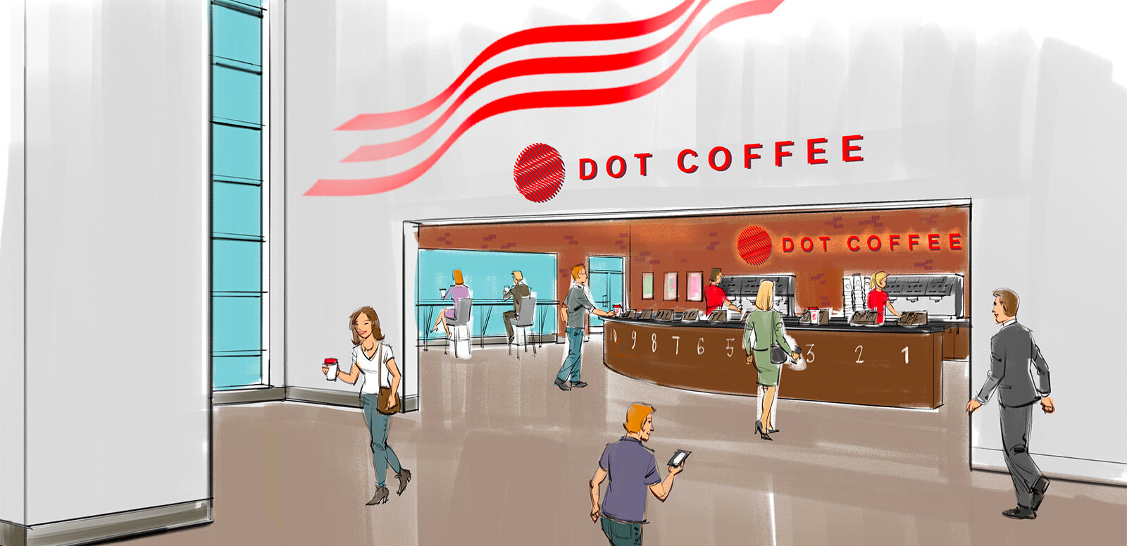
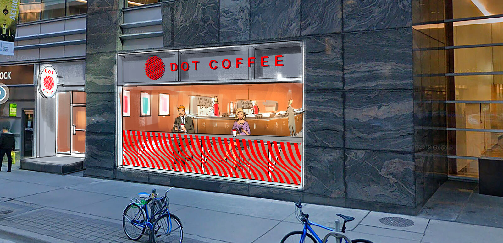
Dot Coffee is an app for busy people on the go; they know exactly what they want, and likely order the same drink every day as part of their routine morning commute into the office. The contactless coffee shop, set to open in downtown Toronto later this year, aims to streamline and simplify the way individuals order their coffee. Customers will have the option to order on-site through a tablet or order ahead of time on the web-app.
Project duration: 2 months
PROJECT BASICS
THE PROBLEM
Dot Coffee identified their target audience as individuals who appreciate good coffee, like routine, but have a general dislike for long lineups and prolonged wait times. Dot Coffee wanted to create a reliable web-app that these individuals could turn to for a succinct menu and a truly seamless ordering process.
THE GOAL
Design a user-friendly app by providing clear navigation and offering an intuitive and quick ordering process.
RESPONSIBILITIES
Brand Identity Design, Package Design and UX/UI through conducting interviews to gather relevant information, digital wireframing, low and high-fidelity prototyping, accounting for accessibility, iterating on designs and responsive design.
RESEARCH
Understanding
the user
1. USER RESEARCH SUMMARY:
I facilitated user research meetings with office workers and coffee drinkers in the downtown area to get a better understanding of their pain points and turned my learnings into empathy maps to strategically target their needs. Through research, users noted that many food ordering apps felt overwhelming and had an abundance of unnecessary interactivity. This inspired me to design a more enjoyable experience by scrubbing away the unnecessary design elements and keeping this app true to it’s “no-frills” type of users.

Name/Age: Vladimir, 32
Education: Waterloo University
Location: Toronto, Ontario
Occupation: Web Developer
2. PERSONA: VLADIMIR
Problem statement: Vladimir’s company has begun a hybrid work model, and for a couple of days a week, he is going back into the office and is building up his travel routine again. He is someone who is a creature of habit and prefers to stick to his schedule. Before heading into the office, he always makes a point to grab a coffee first.
While dealing with the on-going pandemic, Vladimir prefers to make his trips as seamless as possible. He appreciates an app that gives him the ability to schedule his orders ahead of time.
Goals:
- There are times when he orders coffee for his co-workers and would like the ability to save personalized orders so that it can be quickly re-ordered again in the future.
Frustrations:
- Vladimir enjoys inexpensive coffee and will be loyal to a service that provides an easy-to-use app with no fuss
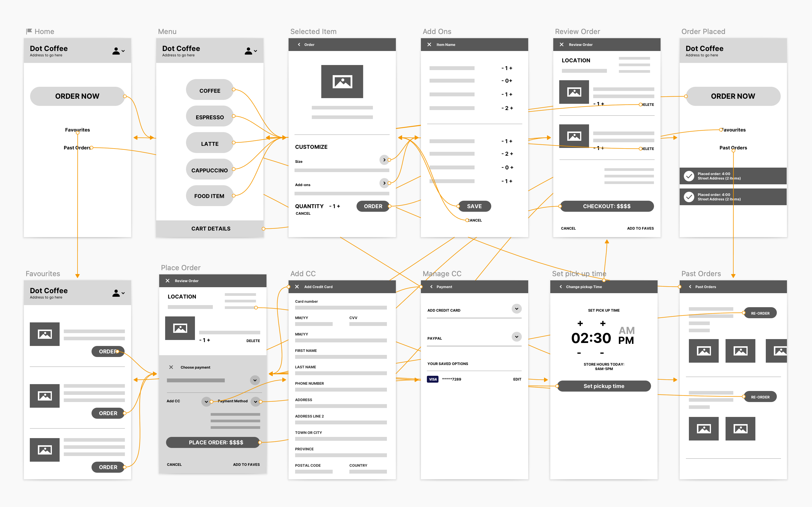
3. USER JOURNEY FLOW
Mapping Vladimir's user journey revealed points of frustration and impatience within the ordering process. Taking these pain-points into consideration, I identified improvement opportunities to help improve the overall experience.

PROTOTYPING
Starting the design
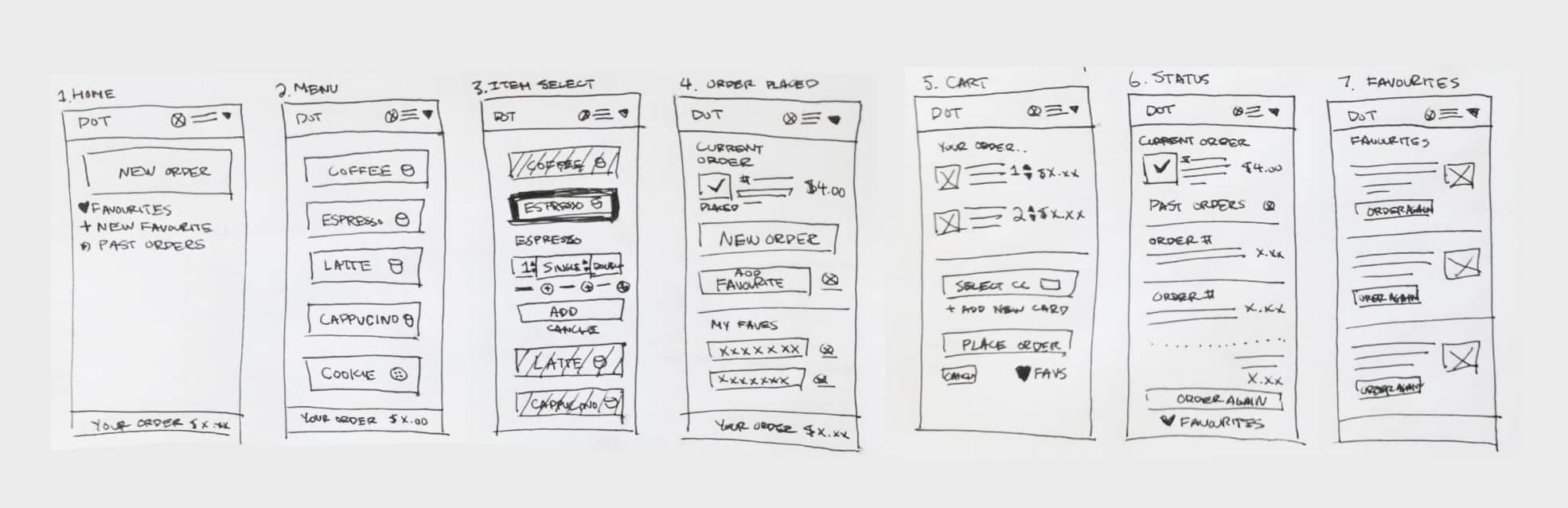
1. PAPER WIREFRAMES:
I sketched out paper wireframes for each screen in my app, keeping the user's pain points about navigation, browsing, and saving personalized orders in mind.
2. CONCEPT EXPLORATION:
In the early stages, I explored a beige/coffee coloured theme that leaned into the "no-frills" messaging, but it lacked visual hierarchy and didn't prove to be a scenario where breaking design rules actually lead to a better design. In this instance, I realized the user testing is what would help determine the visual design, and shifted my focus there to start.
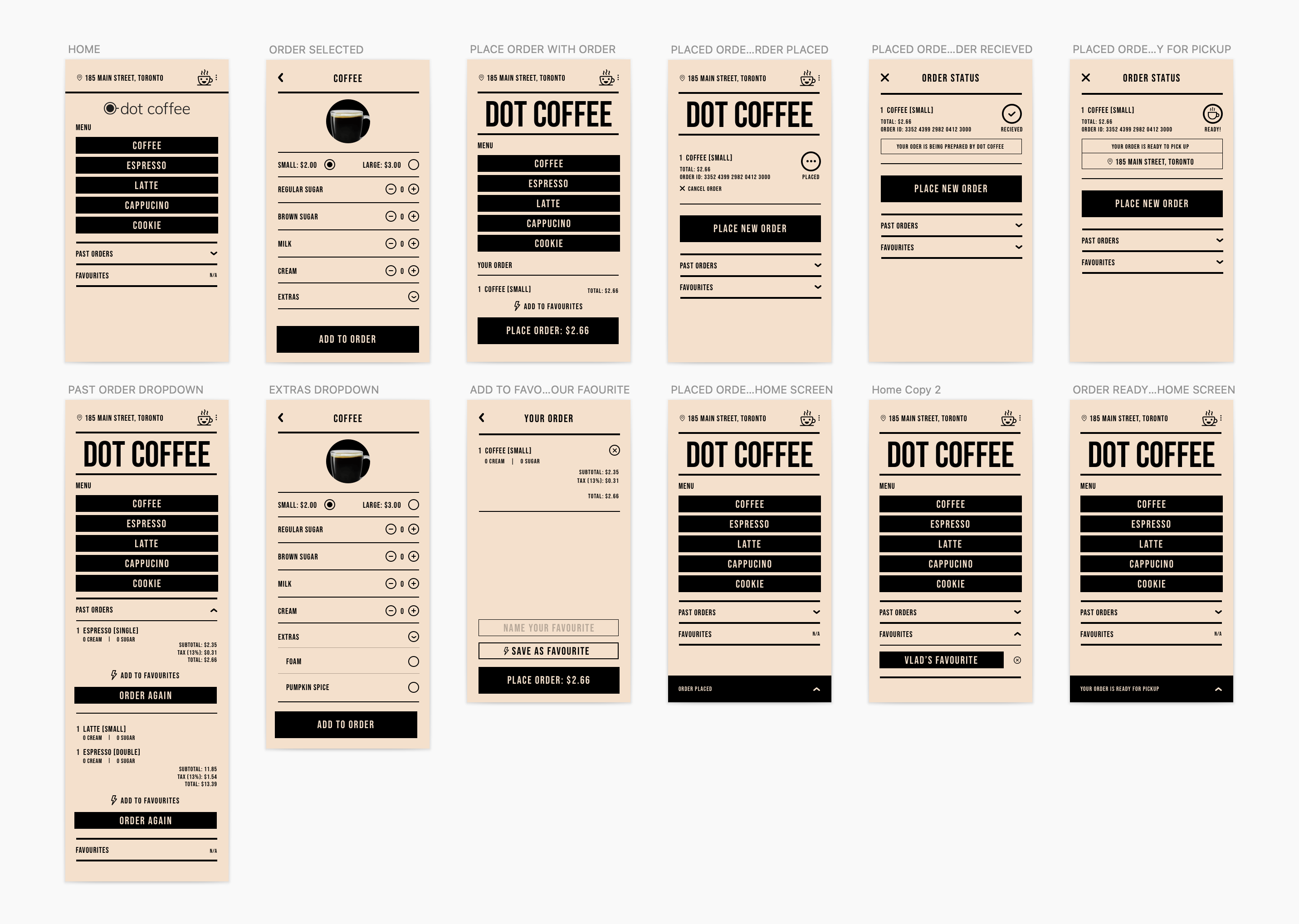
3. LOW-FIDELITY PROTOTYPING:
To prepare for usability testing, I created a low-fidelity interactive prototype in Invision to test the user-flow and journey of the app.
3. USABILITY STUDY: FINDINGS
To prepare for testing, I used the prototype to conduct an unmoderated usability study with 5 participants. Here are the main findings uncovered by the usability study:
A) Easy Access to previous and favourite orders
There needs to be a clear call-to-action to save customized orders and encourage users to use this feature
B) Live Status Update
Testers requested to have a dedicated section on each screen that gives you real time updates on your order
C) Navigation
The dropdown navigation felt like an extra step for the user to take in order to get around within the app.

HIGH-FIDELITY DESIGN
Refining the design
1. MOCKUPS:
Based on the insights from usability studies, I applied changes like adding a sticky nav at the bottom of the screen, adding info modules and other subtle interactive designs that tied the overall experience together.


2. ACCESSIBILITY CONSIDERATIONS
A) I used headings with different size text for clear visual hierarchy
B) I used high contrast rate for the colours
C) I used a healthy amount of text spacing to ensure legibility
2. ACCESSIBILITY CONSIDERATIONS
A) I used headings with different size text for clear visual hierarchy
B) I used high contrast rate for the colours
C) I used a healthy amount of text spacing to ensure legibility
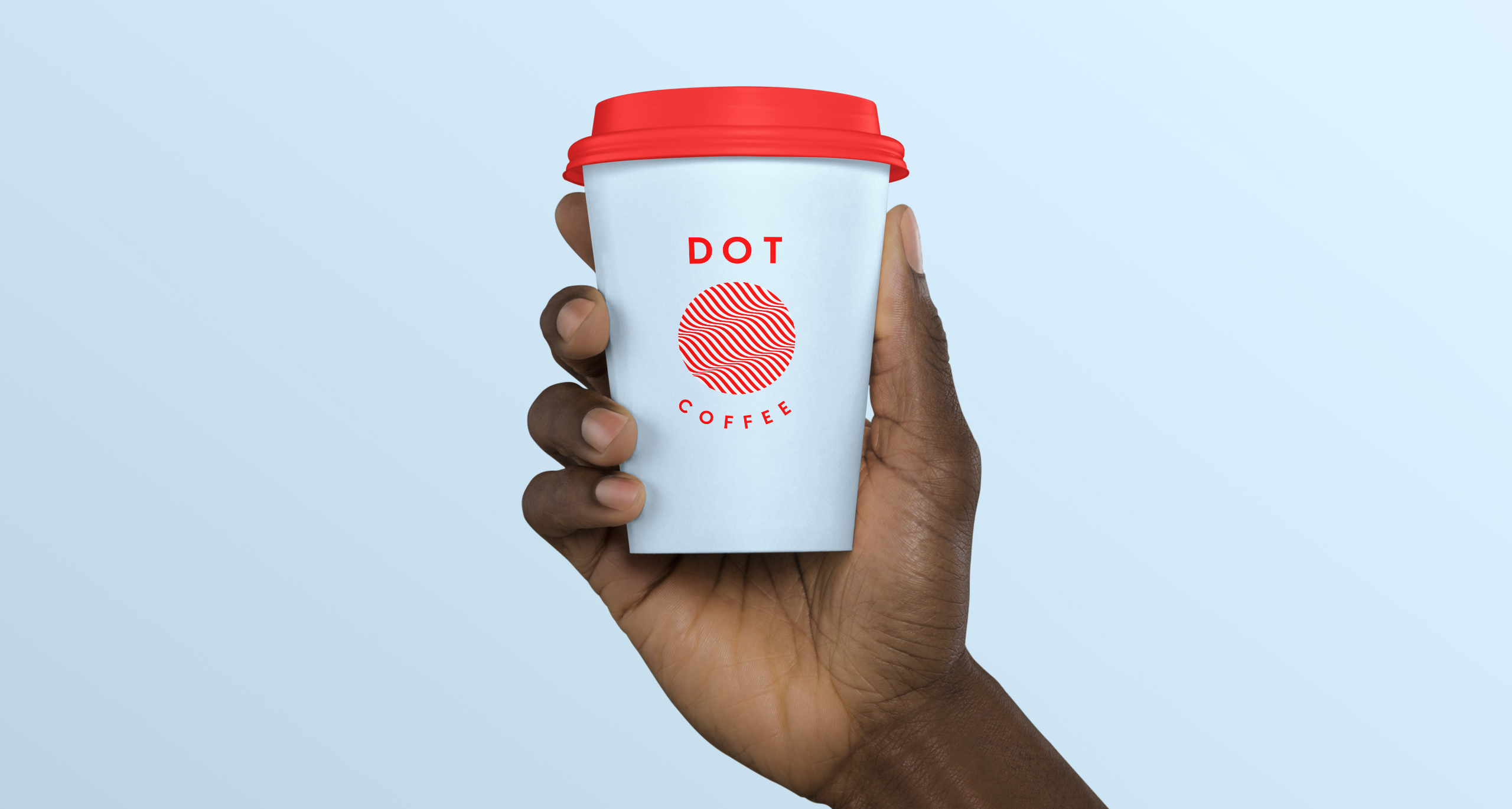
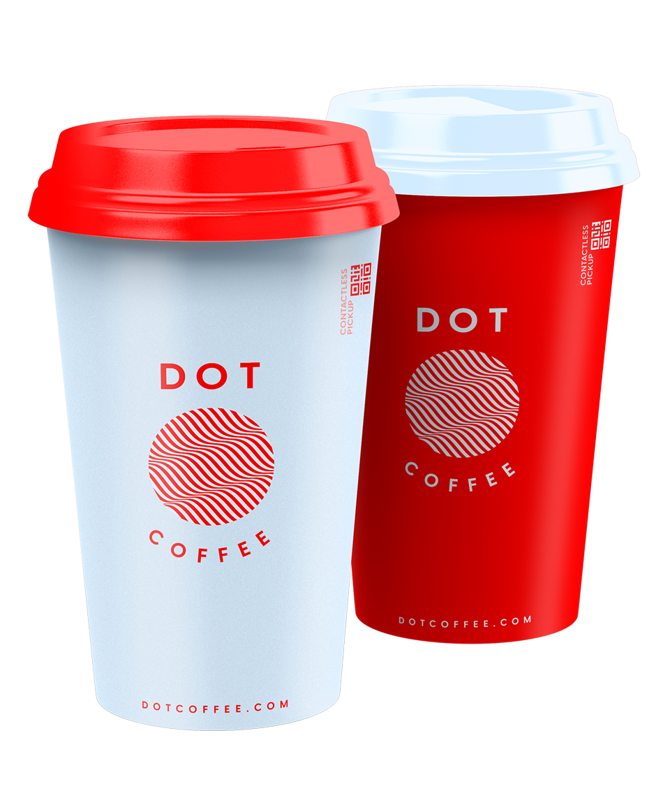
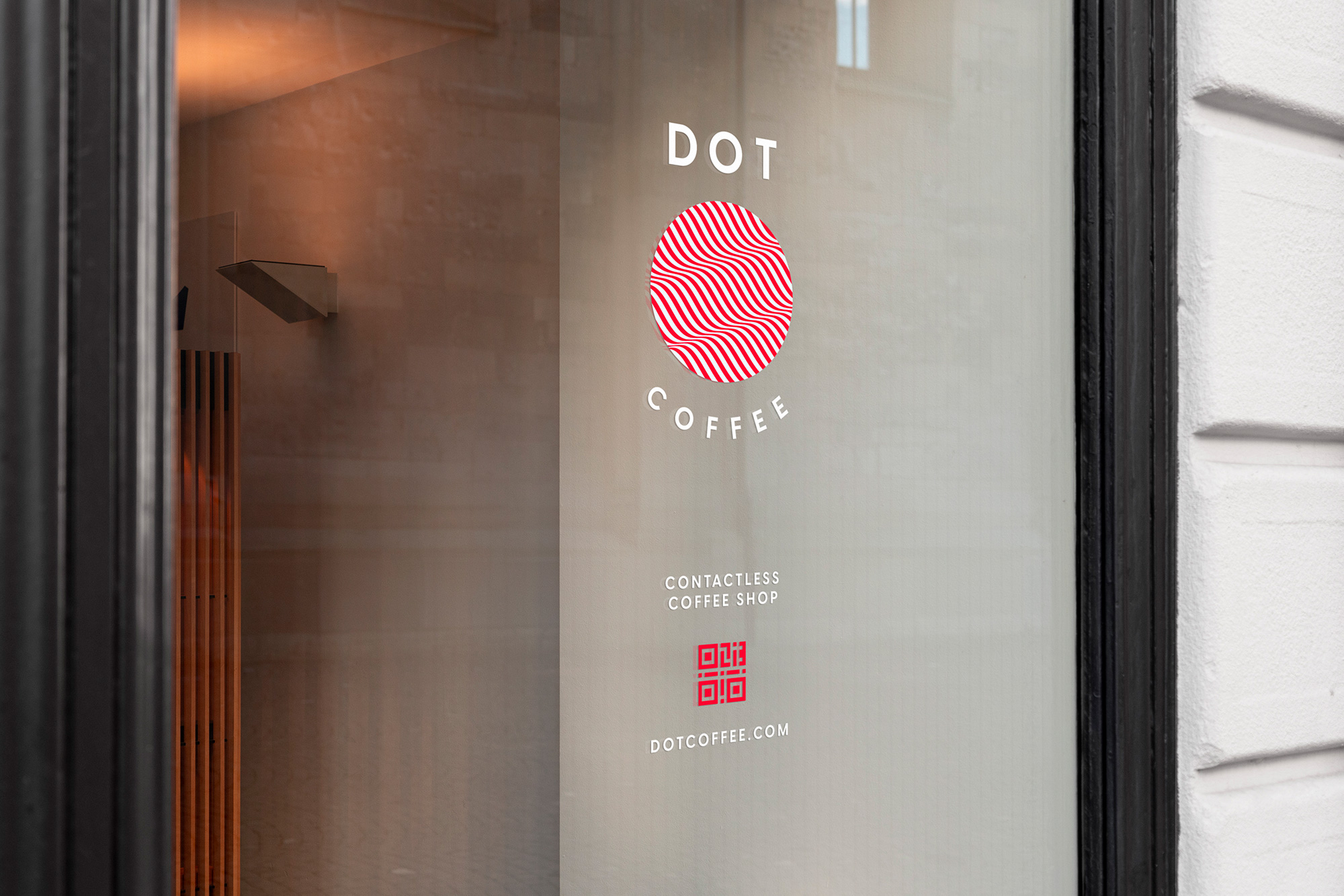
STYLE GUIDE
Brand Identity Design
1. BRAND IDENTITY GUIDELINES:
Consistency in visual language is key to any product design. Below is the brand identity guidelines created to guide the build of the app.

DESKTOP DESIGN
Responsive Design
With the mobile designs complete, I started working on designing the responsive/desktop version of the website. Most users will be using the mobile site to start but may use their desktop to order from their office computer. I used a sitemap to guide the organizational structure of each screen’s design in order to have consistency in the overall experience across devices.


WRAPPING UP THE PROJECT
Going Forward
IMPACT:
Our target users shared feedback about the design being intuitive to use, demonstrated clear visual hierarchy pleasing, and felt like the overall experience of the app matched the brand values and messaging.
IMPACT:
MLSE/Playground Pros shared their new e-learning platform is exactly what they were hoping for and more. One quote from their feedback was that “This website makes our jobs easier as course instructors, we’re excited to move forward with a digital solution especially during these uncertain times”.
WHAT I LEARNED:
Making revisions on your own work is not a result of poor design choices, rather it is part of the process that leads you to making better products.
© MADE BY MIGHTY INC. 2016-2024