


Indo Smoke Brand Identity and Shop Website
Indo Smoke Brand Identity and Shop Website
Indo Smoke Brand Identity and Shop Website
Indo Smoke Brand Identity and Shop Website
A cannabis retail business approached me to give them a turn-key web product that synced their inventory seamlessly between their online and offline sales. This project included a completely original brand identity and shop website.
Project duration: 8 Weeks

PROJECT BASICS
THE PROBLEM
Since the start of 2021, Toronto has doubled the number of cannabis stores. As a result, cannabis shops struggle to find ways to stand out in an oversaturated market.
THE GOAL
To design an identity and create a web product that stands out from the competition and stands for something that customers can resonate with.
RESPONSIBILITIES
Account management, project management, creative direction, ux design, merchandise design and production.


TARGET AUDIENCE
Understanding the customer
1. USER RESEARCH SUMMARY:
I conducted user interviews with cannabis business owners, and cannabis shoppers to get a clear understanding of their pain-points. I discovered that many felt like the brands on the current market felt too commercialized and that they actually missed the grass-roots feel of cannabis culture before it became legalized.

Name/Age: Micaela, 31
Education: York University
Location: Toronto, Ontario
Notes: Trendy, and experienced cannabis user
2. PERSONA: MICAELA
Problem statement: Micaela lives downtown Toronto and has many cannabis stores around her to choose from. She prefers a store with a neighbourhood feel with friendly staff. She doesn't like the main-stream stores and will stick with brands that are independently operated and authentic in their messaging.
Goals:
- She wants to build a connection with a retail store and be a loyal customer as long as she’s getting the best price and experience
Frustrations:
- Too many cannabis stores that are run by large corporations
BRAND IDENTITY DESIGN
Indo Smoke Brand Identity
1. NAMING:
"Indo" is 90's slang for growing cannabis "indoors" back when in the day before legalization. Who remember's the song, "Rollin' down the street, smokin' indo, Sippin' on gin and juice, laid back..."? If you know what it meant back then, then there's a good chance this brand will resonate with you today.
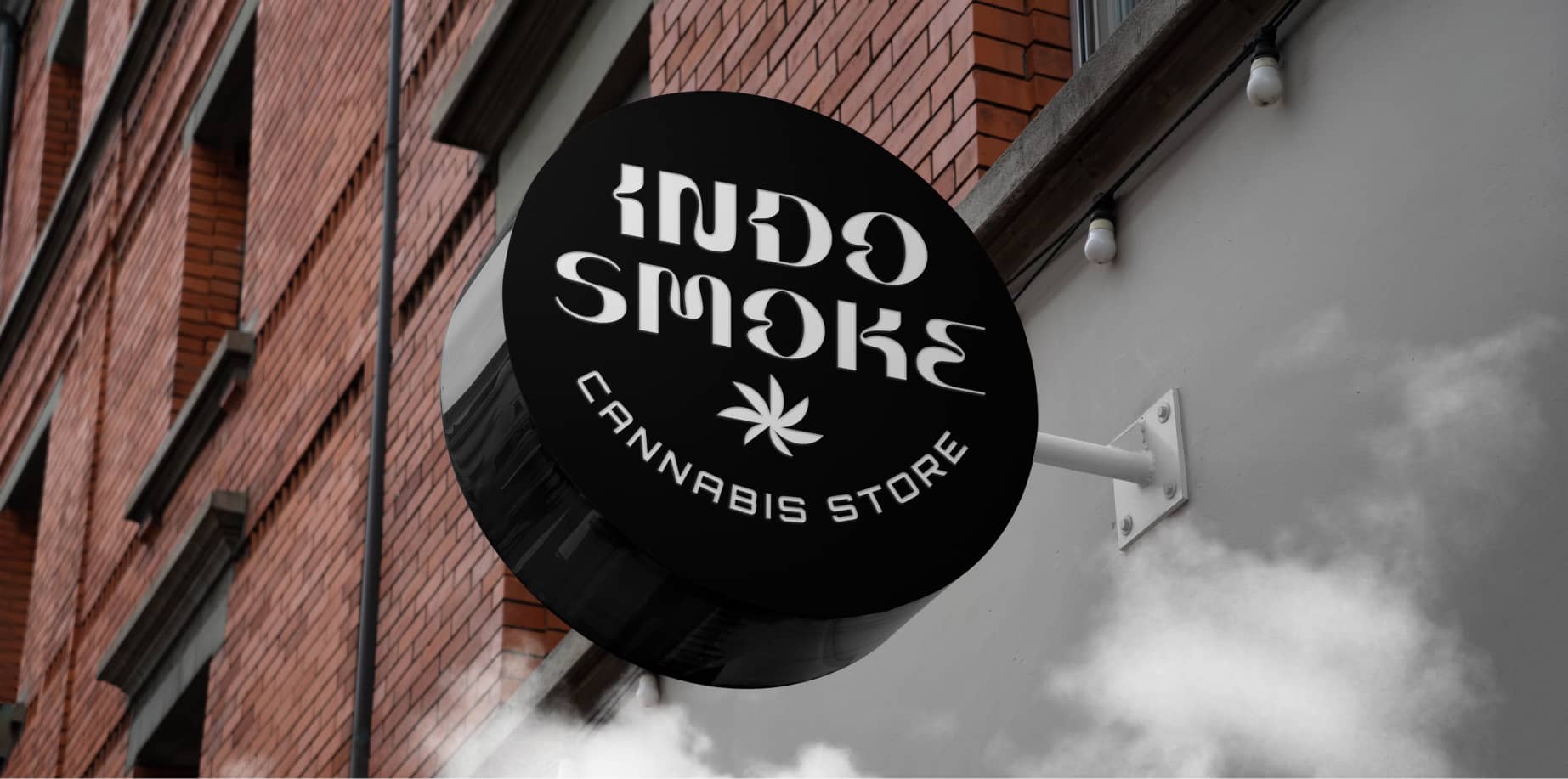
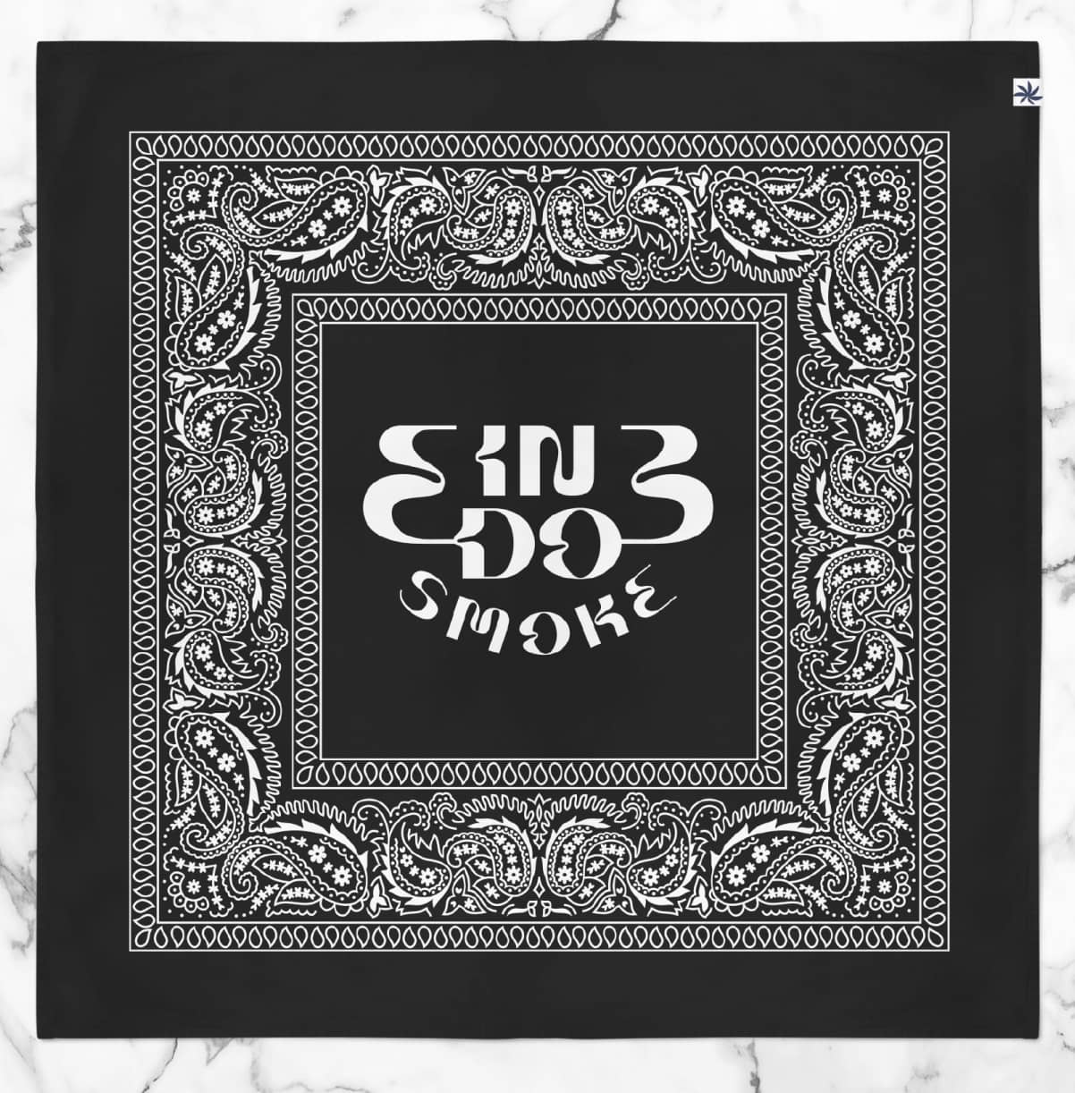
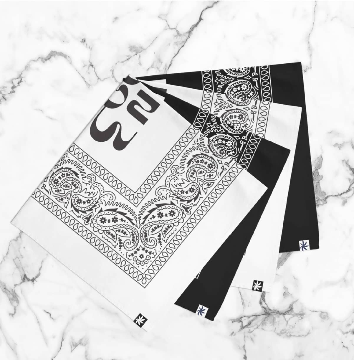
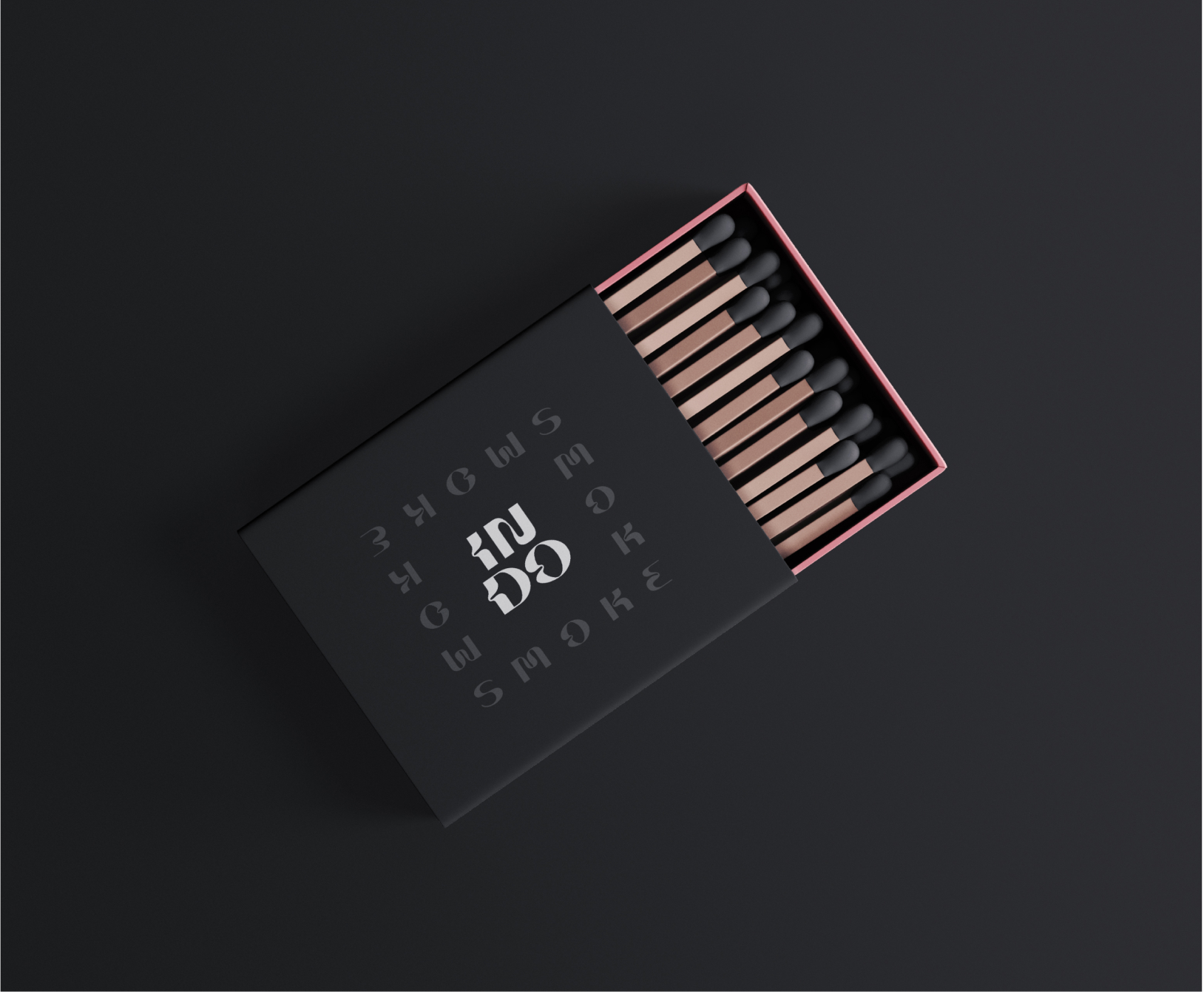
2. LOGO DESIGN:
To differentiate this cannabis brand from others, I designed a logo with some visual flare that no other mainstream cannabis companies are doing.
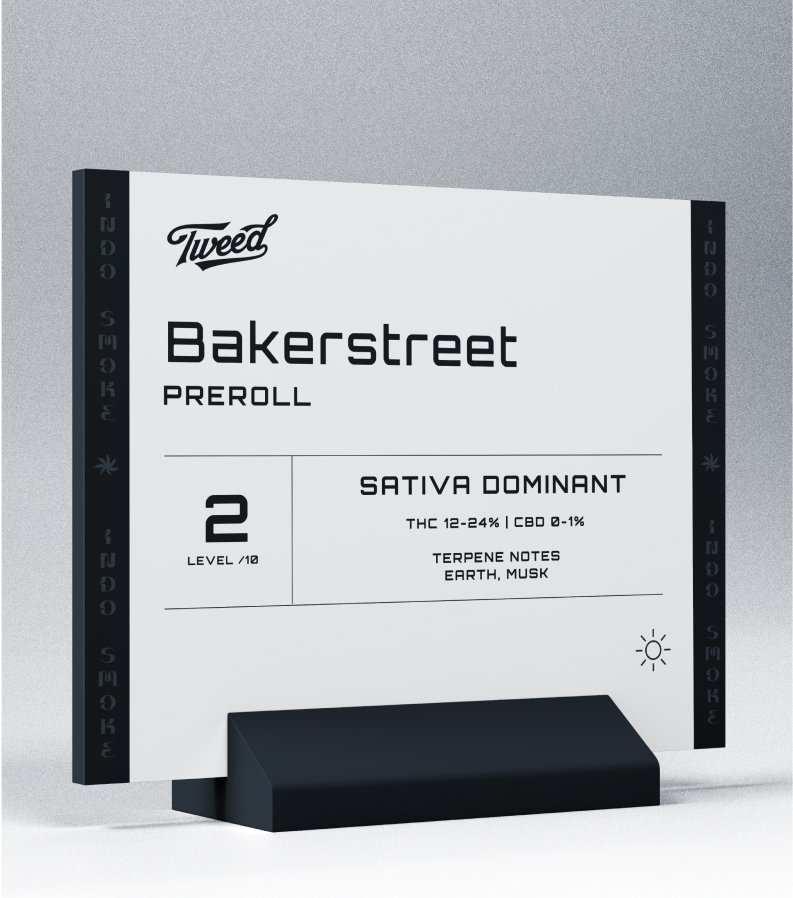
3. COLOUR + ICONOGRAPHY + TYPOGRAPHY
In Ontario, there are some pretty strict laws with how a cannabis retail store can be branded. These laws prohibit any graphical treatment that suggests smoking or consuming cannabis. Working within these parameters, I used a wide range of colours and expressive typography to represent a fun and exciting brand without crossing any lines with marketing and branding.


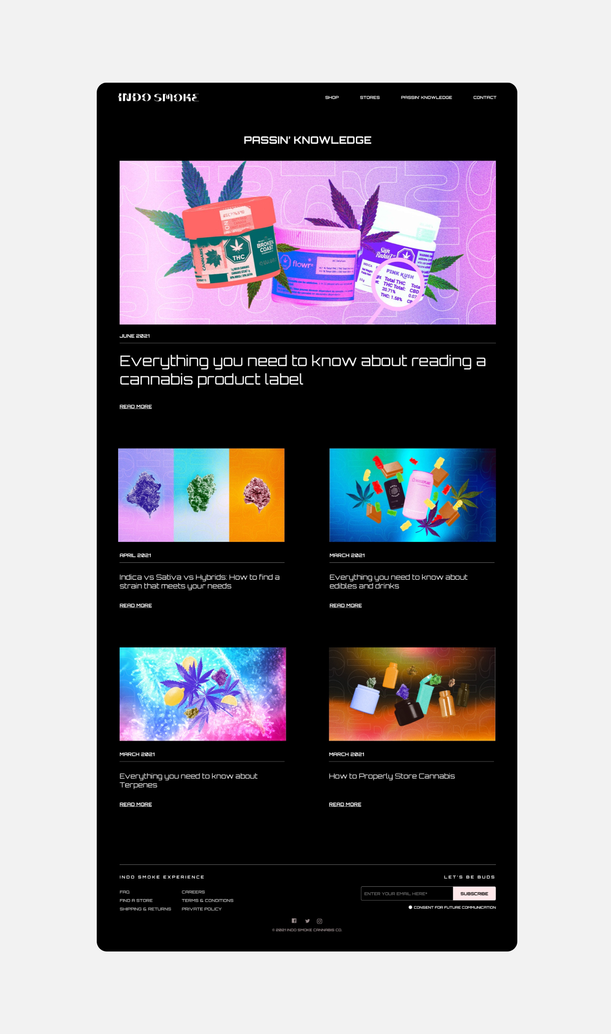
MAKING THE WEBSITE
Starting the design
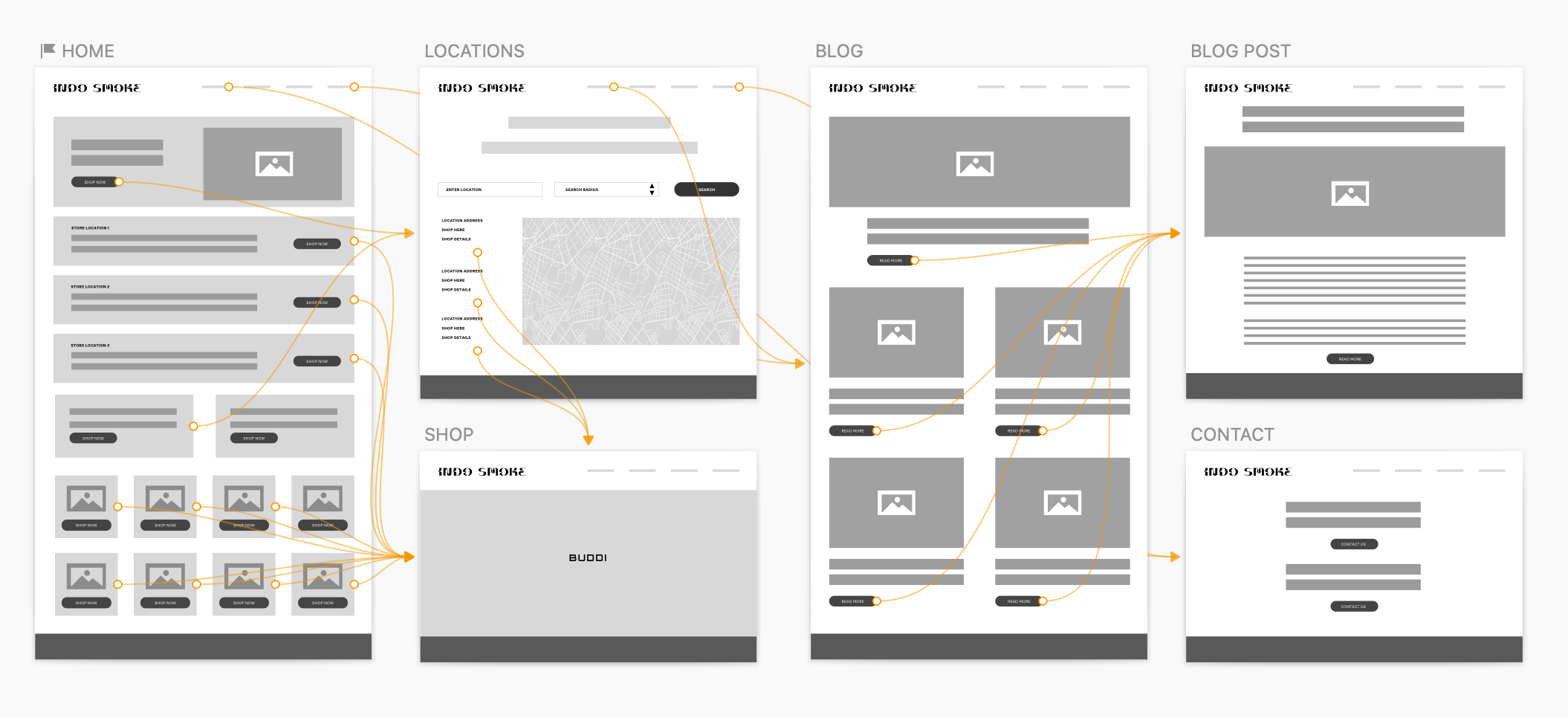
1. WIREFRAMING:
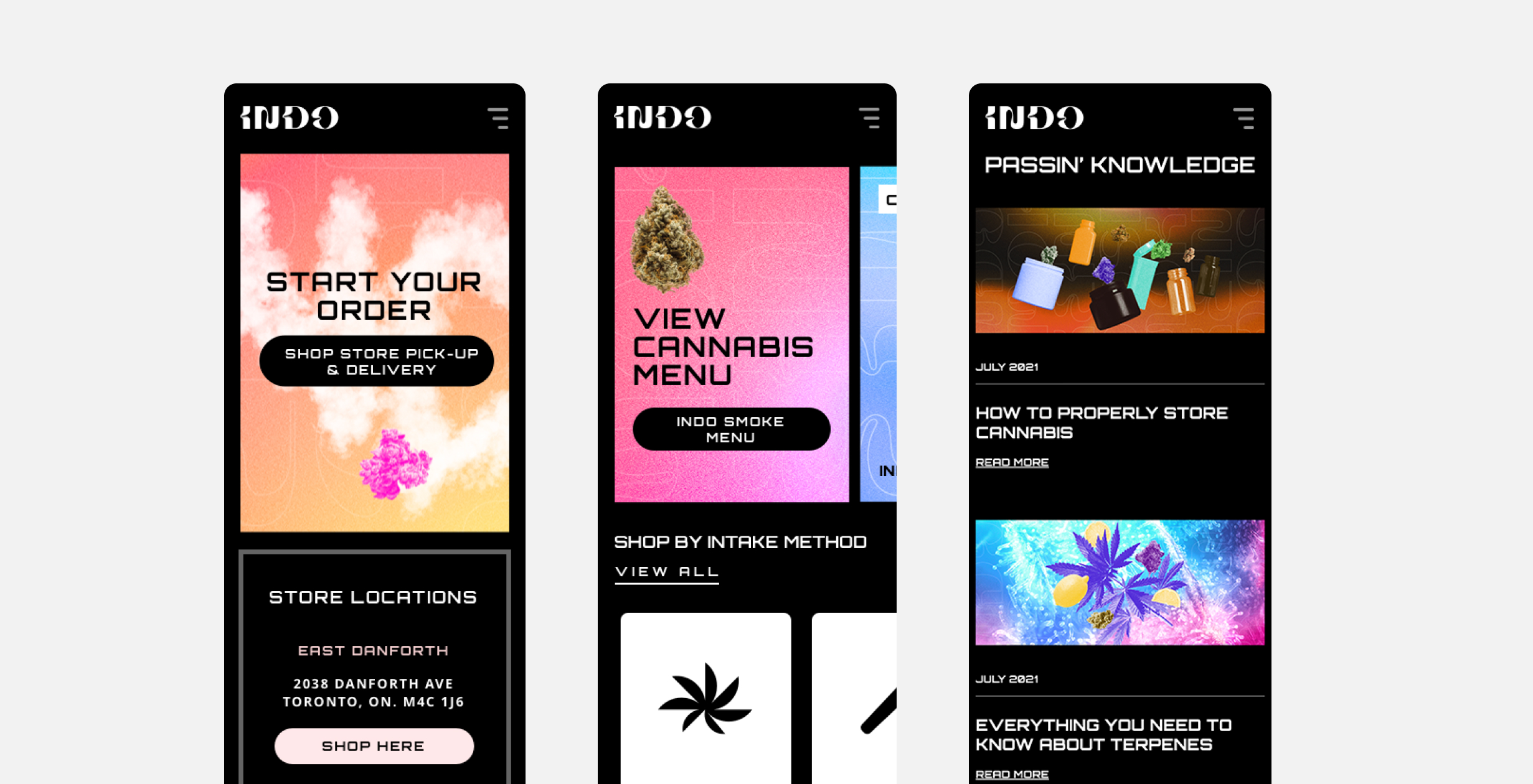
Creating Digital wireframes made it easy to understand how the user experience design could help address user pain points and improve the website alltogether. Prioritizing useful button locations and visual element placement on the home page was a key part of my strategy. I also designed the journey to fit within the requirements of using a 3rd party shop plugin called Buddi. Since Indo Smoke has 3 locations, and I designed the user journey to start by selecting the location before heading to the shop page to purchase. I did this because each location has slightly different inventory and I didn't want users to pick their product first and find out at check-out that it's not available.
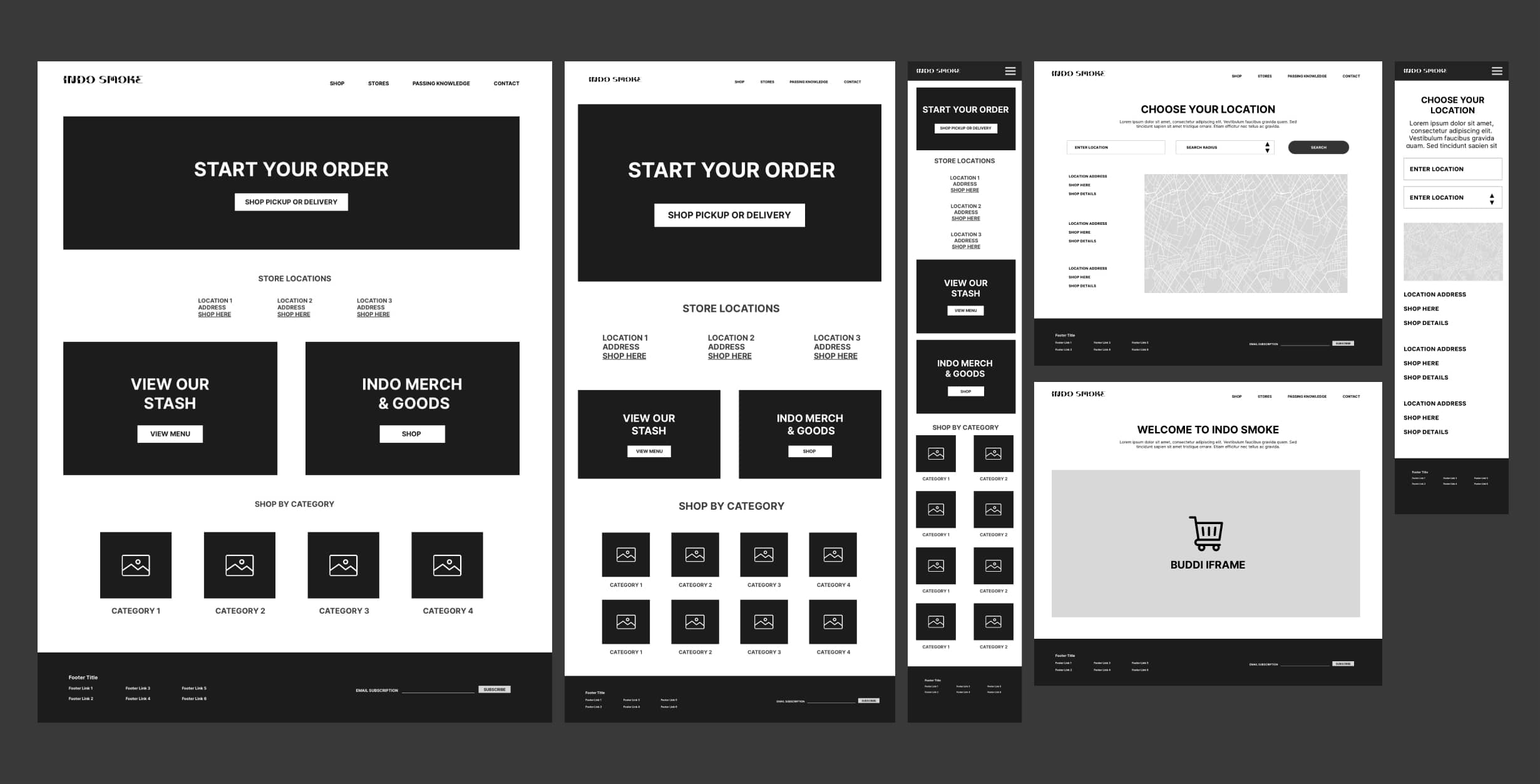
2. LOW-FIDELITY PROTOTYPING:
To prepare for usability testing, I created a low-fidelity prototype of the Indo Smoke website from the perspective of a new customer visting for the first time. I prioritized the journey of selecting the store first before heading to the shop because the inventory is different across all stores and will require customers to purchase from specific stores.
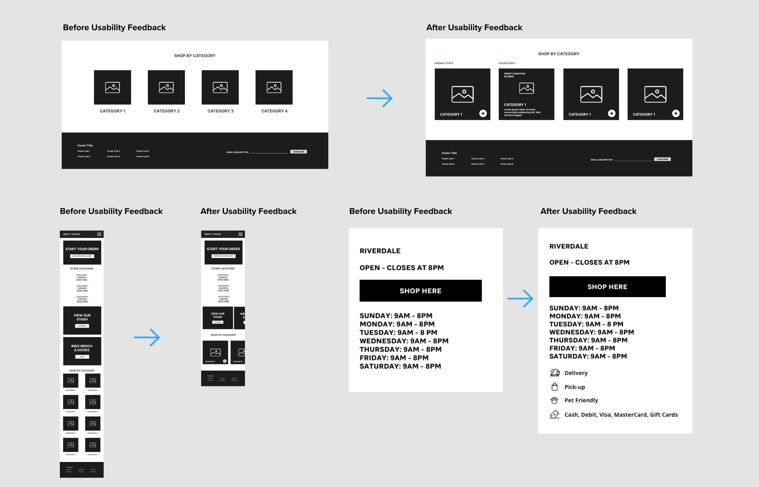
2. USABILITY FEEDBACK:
These were the main findings uncovered by the usability study:
A) Shop by Category
Users wanted a bit more detail on each category without sacrificing the look and feel
B) Mobile Scroll
Once at the home screen, users pointed out that there was too much scrolling to get to where they wanted to
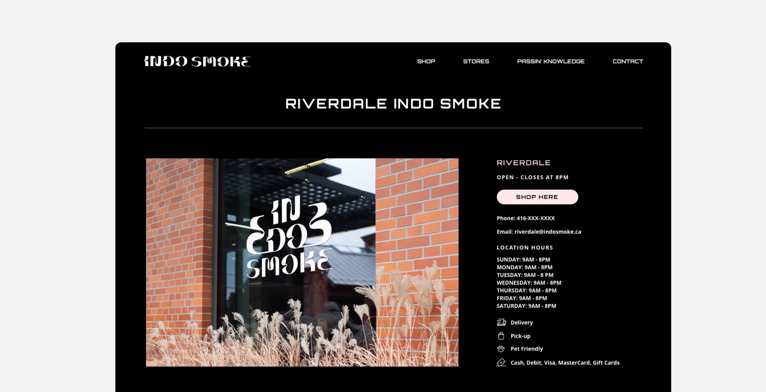
C) Store Location Overviews
Users wanted the ability to view at a glance to see if the store allowed pets, delivery, pick-up, and other quick details alike. They don't want to have to look for these details or call the store to find out.
Refining the design
1. MOCKUPS:
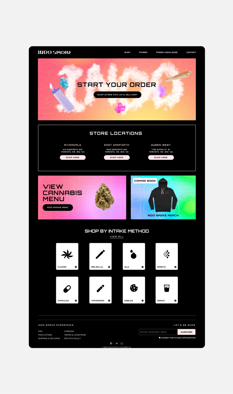
Based on the insights from the usability study, I made changes to improve the mobile scrolling experience and overall visual content of the site. One of the changes I made was creating sliders for certain sections on the home page that otherwise stacked in my previous designs, and this change made the scrolling experience much shorter for users.
To make information clear about each store, I added icons for store details such as, delivery, pick-up, pet friendly and method of payments.
To add more clarity on each category or "intake method", I added hover states that provided more details on each respective category. This gave the user a little more information about each category before they click and shop the chosen category.
2. ACCESSIBILITY CONSIDERATIONS
A) I used headings with contrasting size of text for clear visual hierarchy
B) I used high contrast rate for the colours
C) Widescreens will not experience large widths of paragraphs for legibility purposes
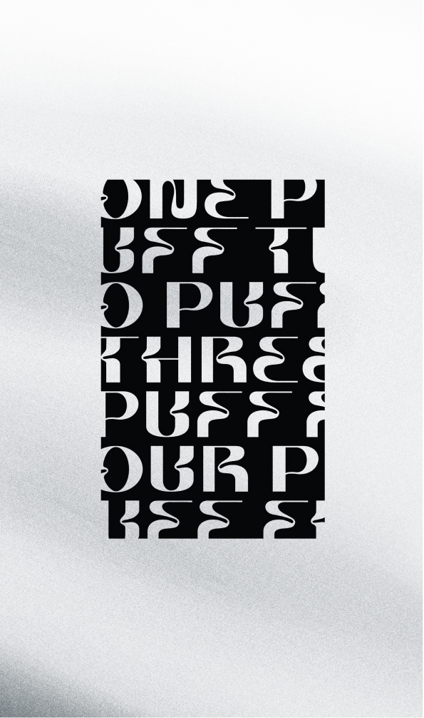
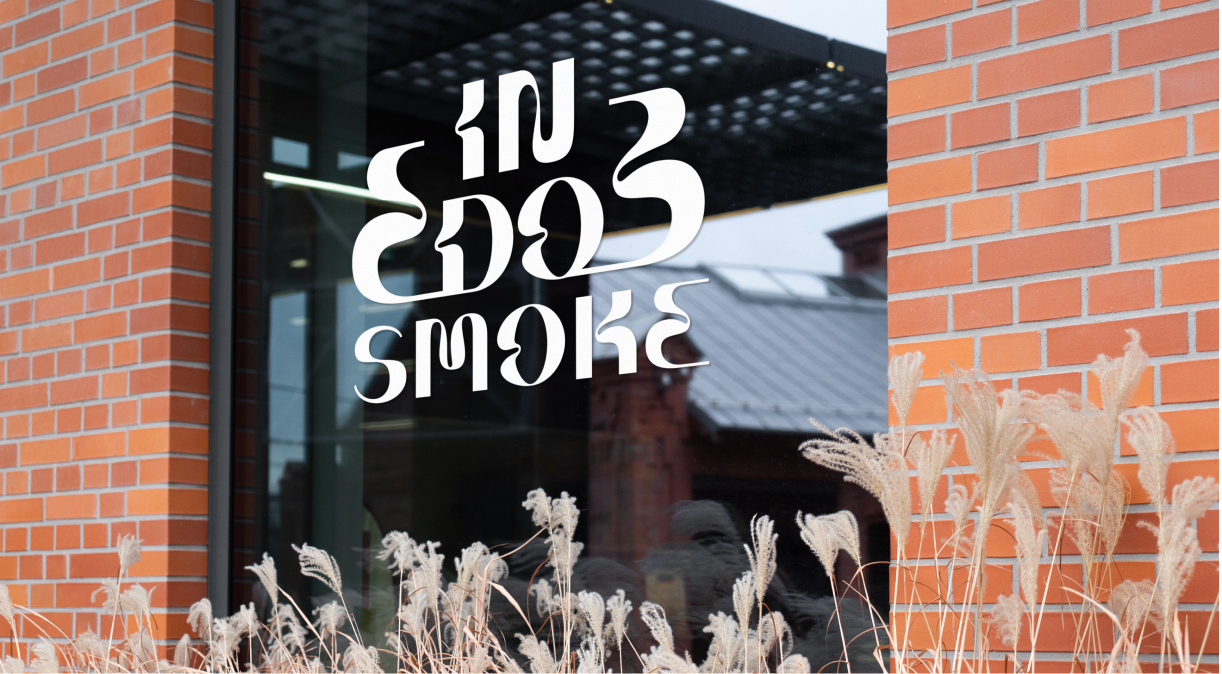
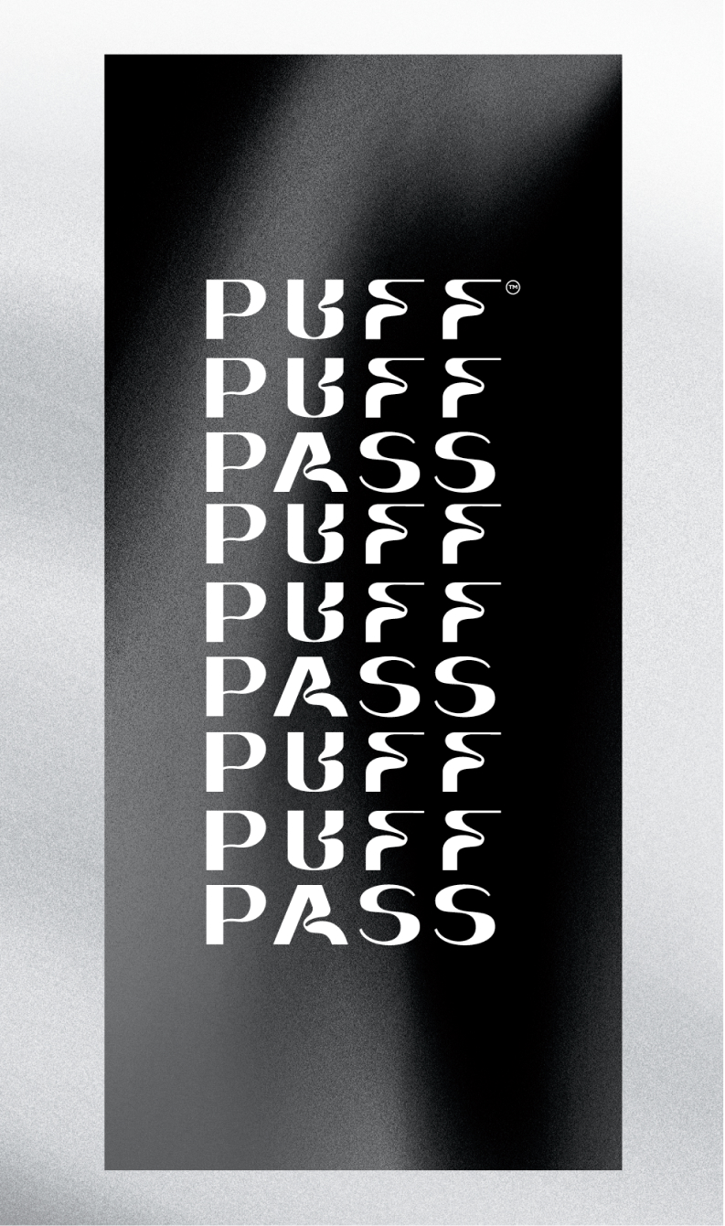
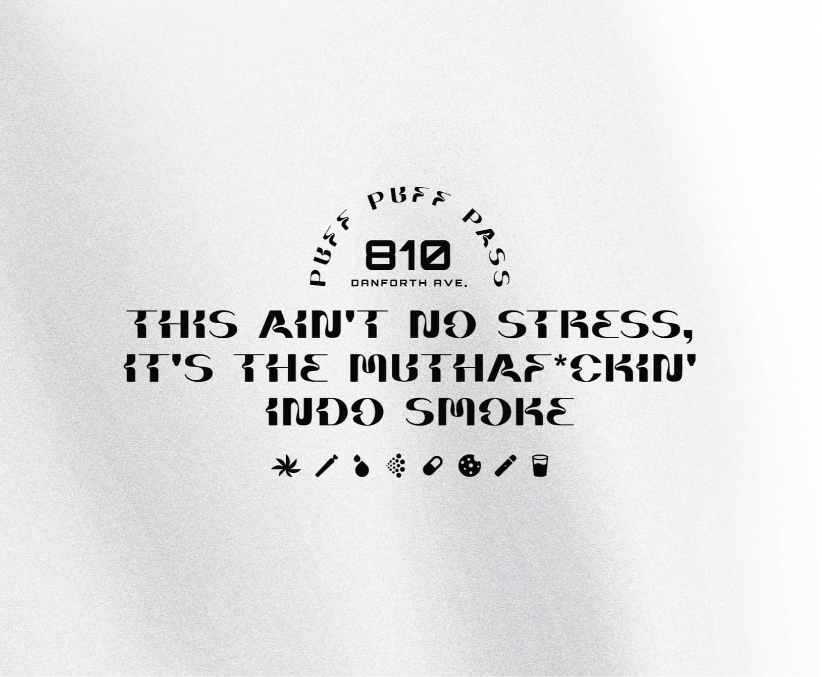
STORE SIGNAGE DESIGN
Retail graphics
Keeping within the Ontario laws of branding store-fronts, I focussed heavily on typographic designs that resonates with our target demographic. “Puff puff pass” can be seen as a staple graphic throughout all three locations of the stores.
WRAPPING UP THE PROJECT
Going Forward
IMPACT:
With a new name, and brand identity, Indo Smoke successfully launched their online and retail space together for spring 2022.
IMPACT:
MLSE/Playground Pros shared their new e-learning platform is exactly what they were hoping for and more. One quote from their feedback was that “This website makes our jobs easier as course instructors, we’re excited to move forward with a digital solution especially during these uncertain times”.
WHAT I LEARNED:
Cannabis branding laws are strict but there’s a good reason for it too. With that being said, it was important to turn these limitations into opportunities to do something completely different and unique.
© MADE BY MIGHTY INC. 2016-2024