


Feel your coffee.
Feel your coffee.
Feel your coffee.
Feel your coffee.
CLIENT FOCUS: BRAND IDENTITY DESIGN, PACKAGE DESIGN, ECOMMERCE
FEEL COFFEE
BUILDING A BRAND AND SHOP FOR FEEL COFFEE COMPANY
SERVICES:
— STRATEGY
— BRAND IDENTITY
— PACKAGE DESIGN
— UX/UI DESIGN
PARTNERS:
— VLAD BARANOV, FULL-STACK DEVELOPER
THE PROJECT
Feel Coffee hits different. Their approach to coffee is to focus soley on the “feeling” you get from drinking coffee, while intentionally staying away from any reference to “taste”. Founder of Feel Coffee, Vlad Baranov, and partner Scott Rao, approached us to create a bold brand identity that reflected their unique approach to the coffee industry.
BRAND IDENTITY & WEBSITE
BRAND IDENTITY & WEBSITE
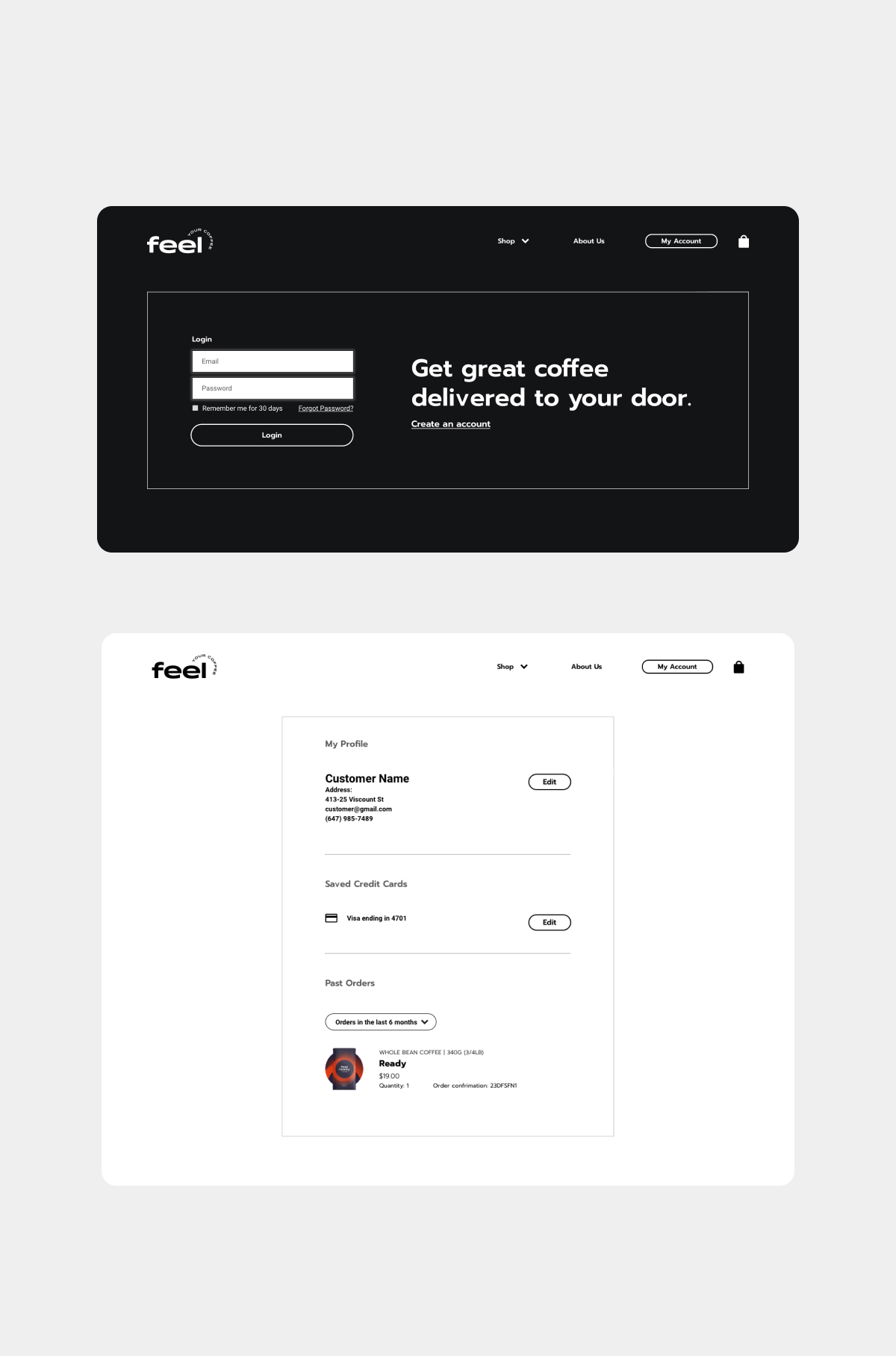
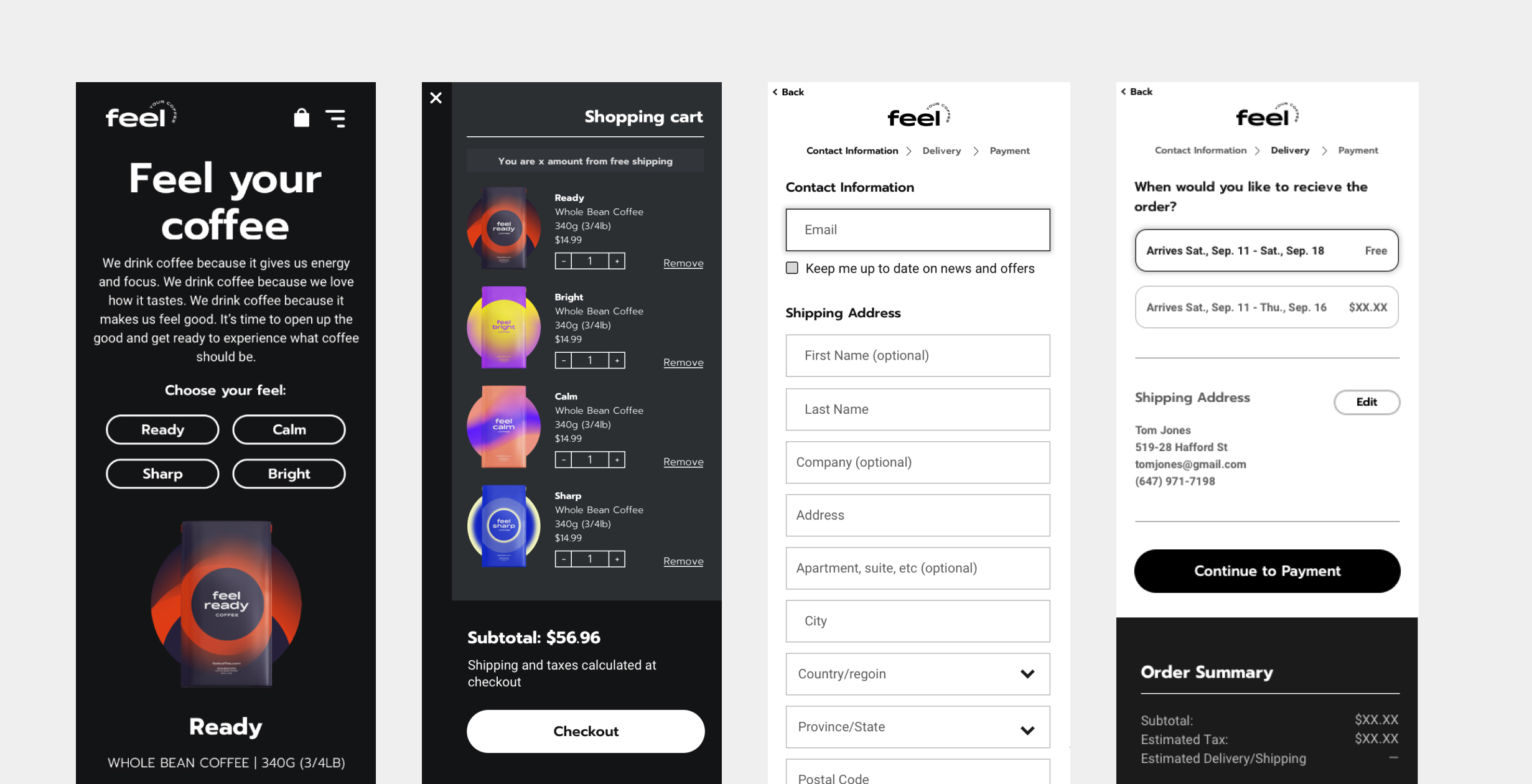
THE BRAND IDENTITY & WEBSITE
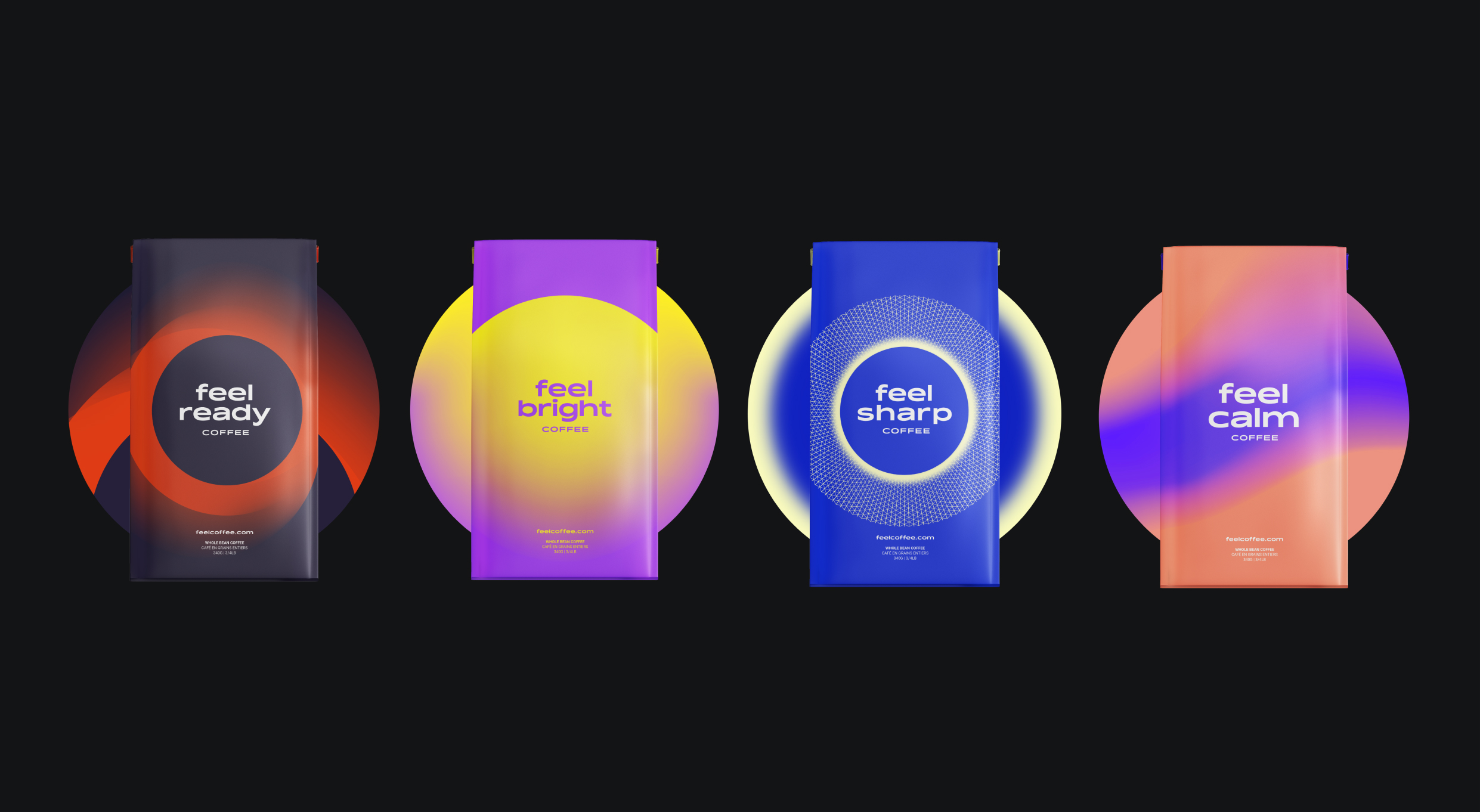
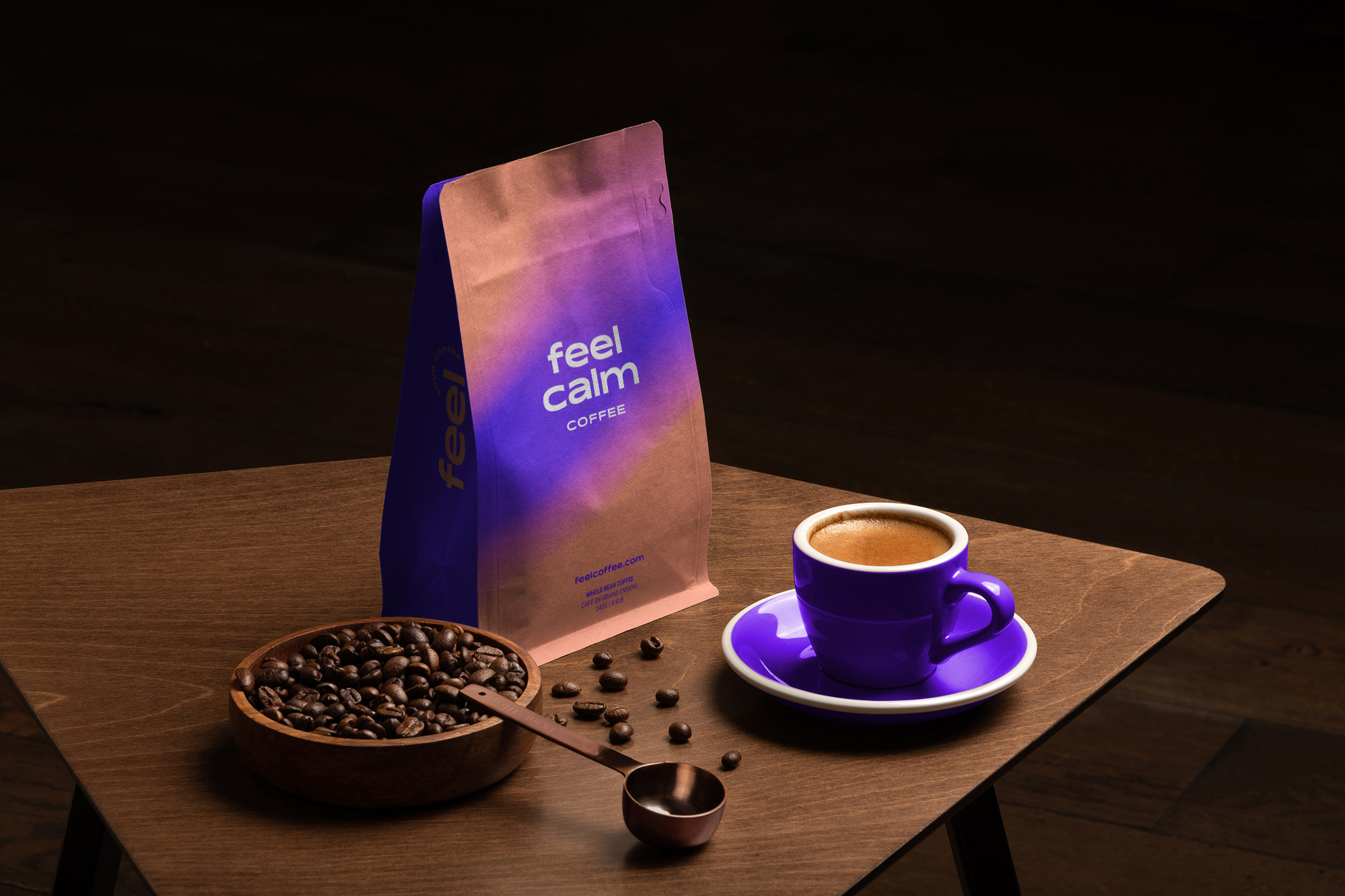
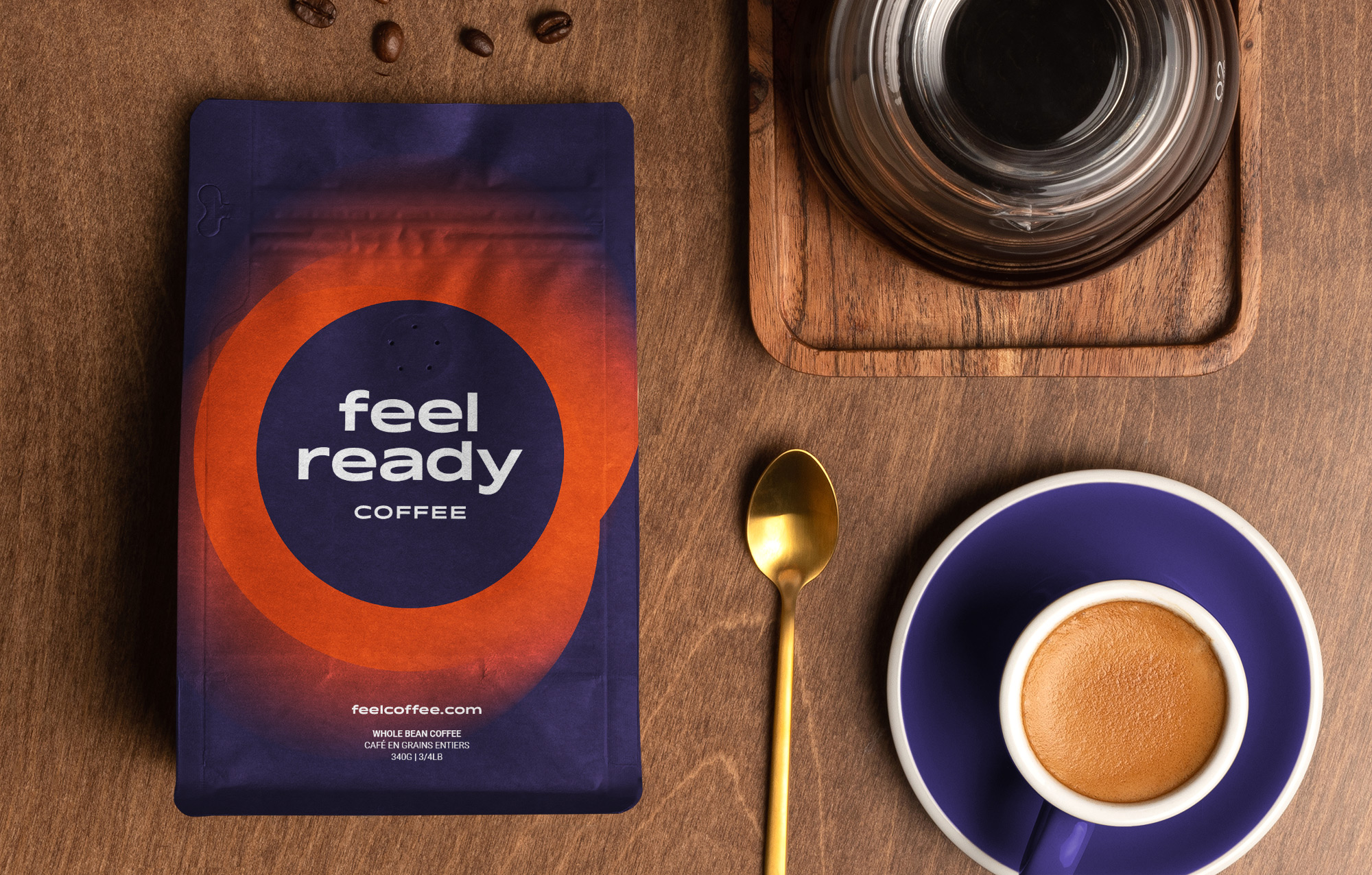
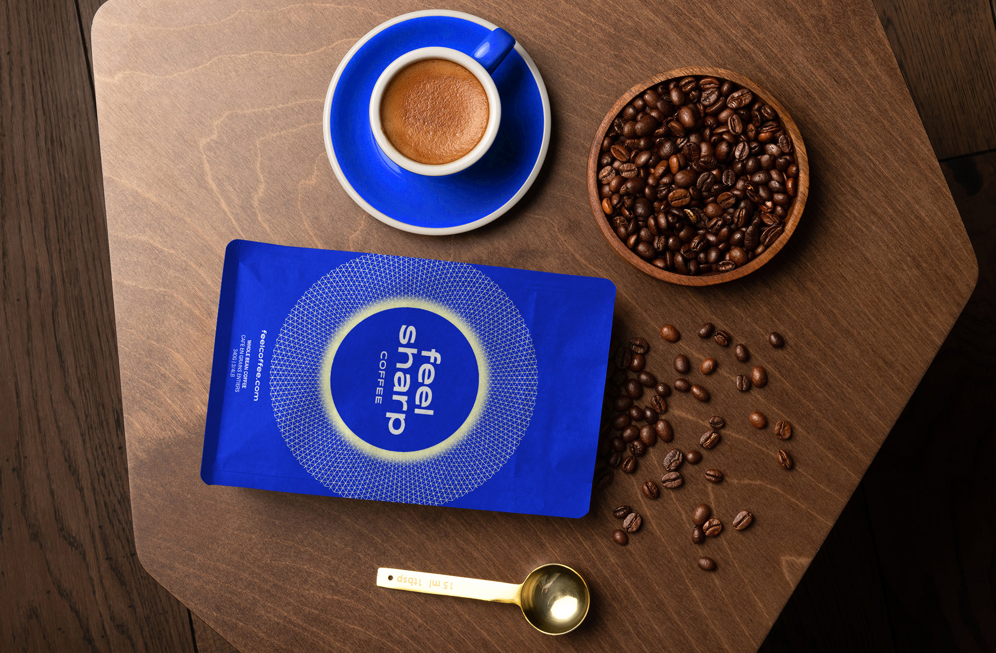
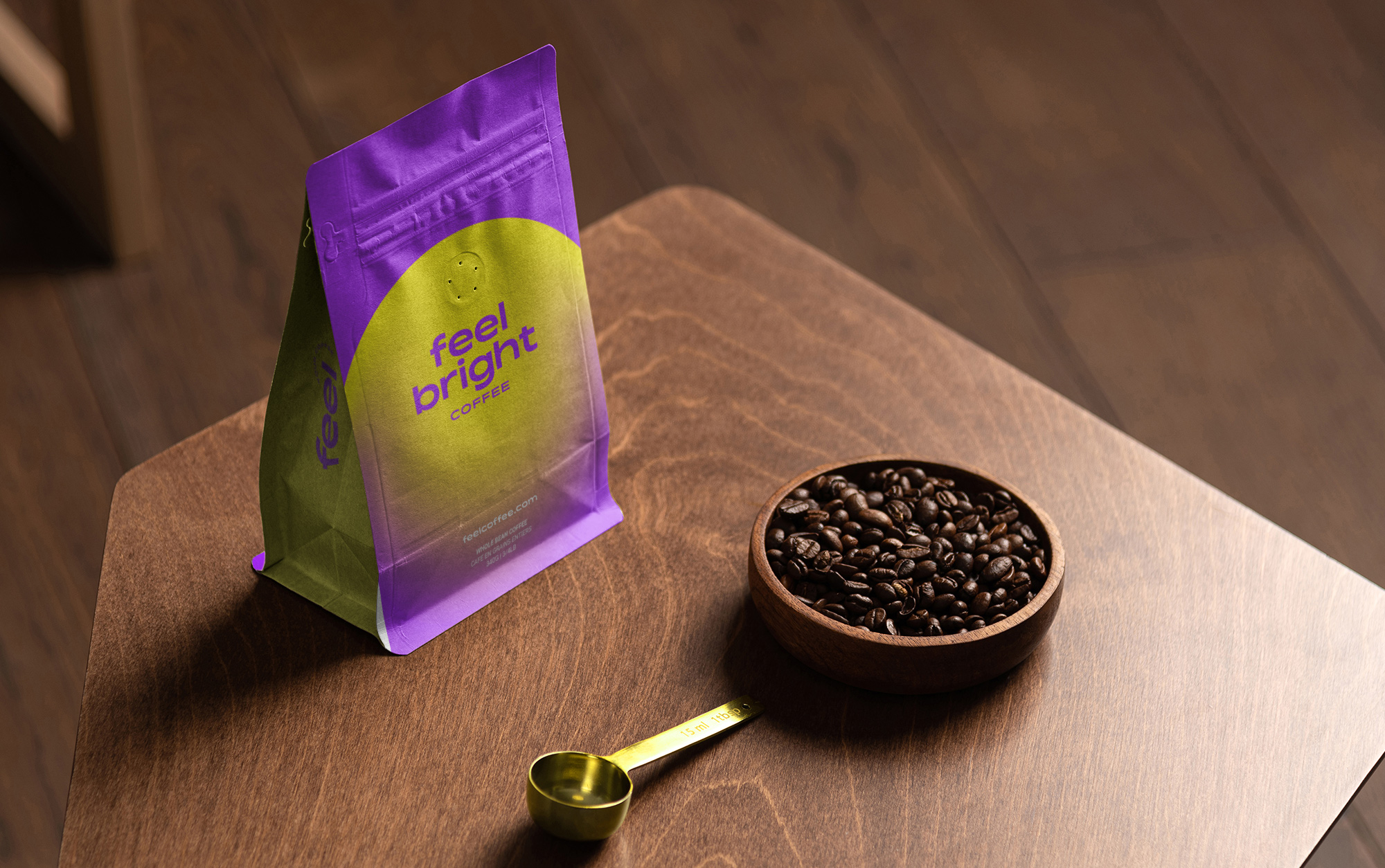
Feel Coffee approached us with a challenge to design 5 distinct bags that represents each individual “feel” of the coffee. In their lineup of coffee, there is, “Ready”, “Bright”, “Sharp”, and “Calm”. It was important to the owners to have an abstract package design that invoked emotion and curiosity. We created the five package designs together closely with the owners, using colour/shapes as the main visual communication for each respective “Feeling”.
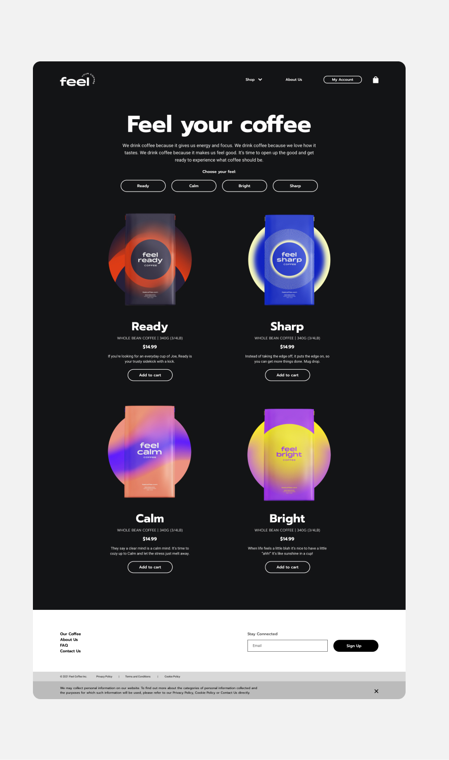
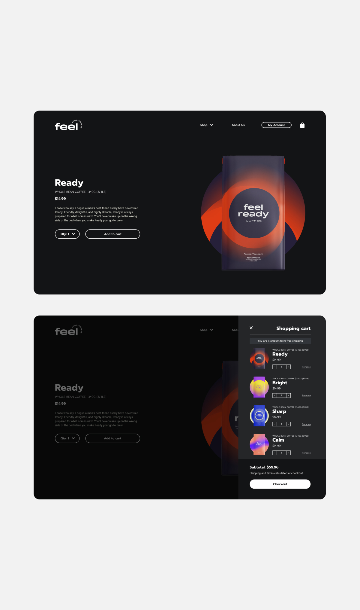
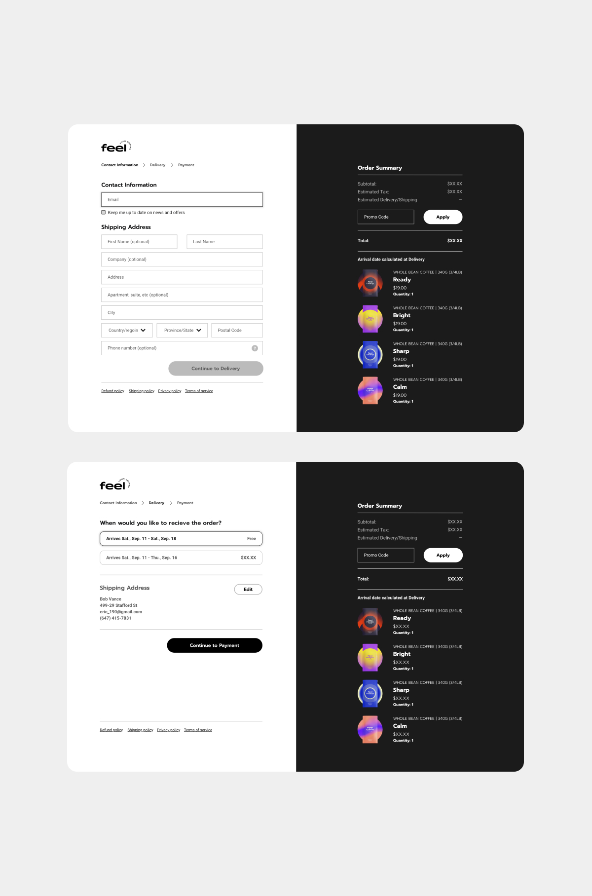
The website is designed with a dark theme to give a nice visual contrast in colour that each package design has. The landing page is minimal and focuses primarily on encouraging users to buy and add to cart. The user-experience is quick and intuitive. This “less is more” approach leaves room for impulsive purchases given how easy the check-out process is.
© MADE BY MIGHTY INC. 2016-2024