Brand Identity + Merch’ Design & Custom Shopify Website for Ezekiel Elliott
Brand Identity + Merch’ Design & Custom Shopify Website for Ezekiel Elliott
Brand Identity + Merch’ Design & Custom Shopify Website for Ezekiel Elliott
Brand Identity + Merch’ Design & Custom Shopify Website for Ezekiel Elliott
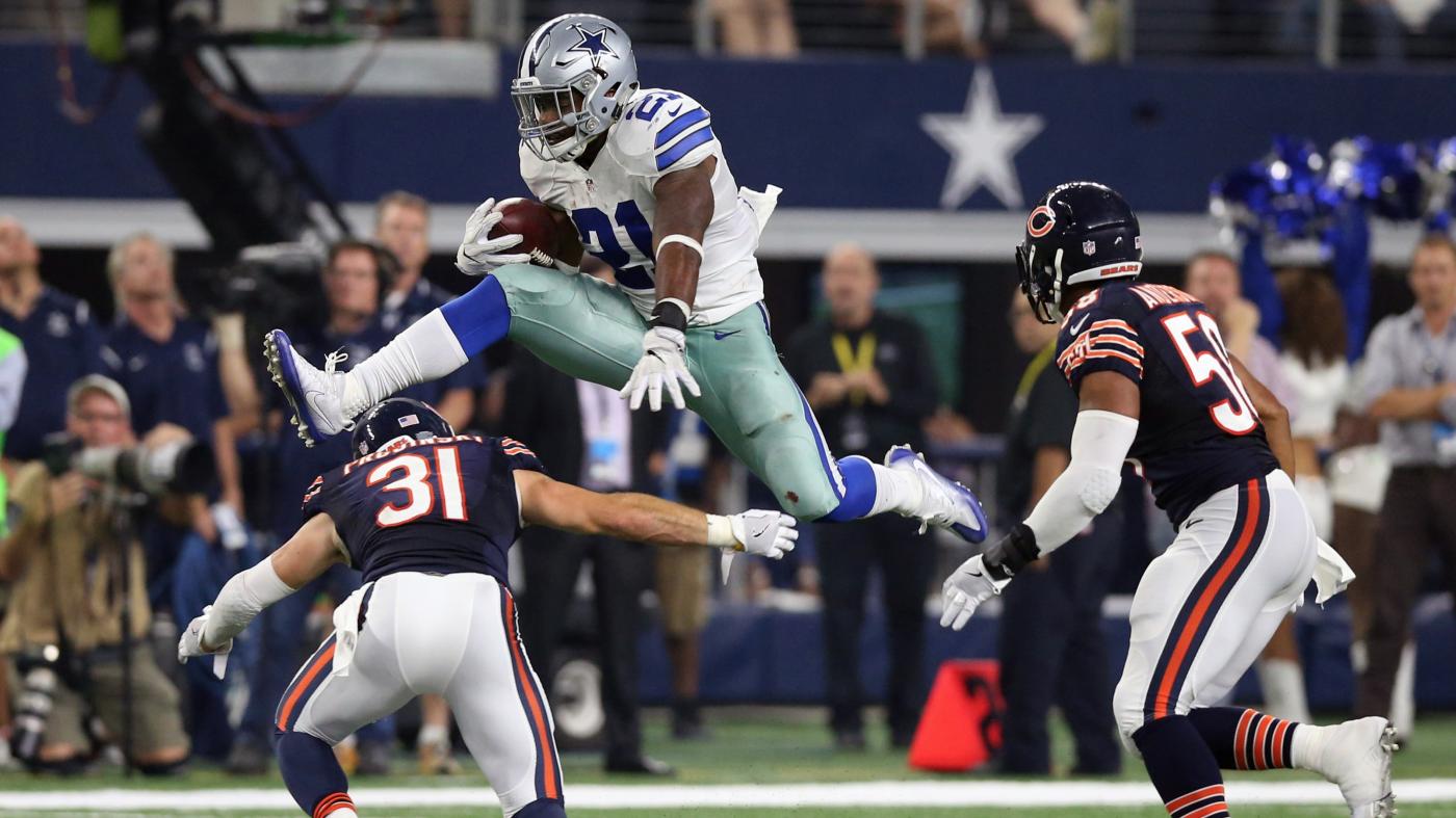
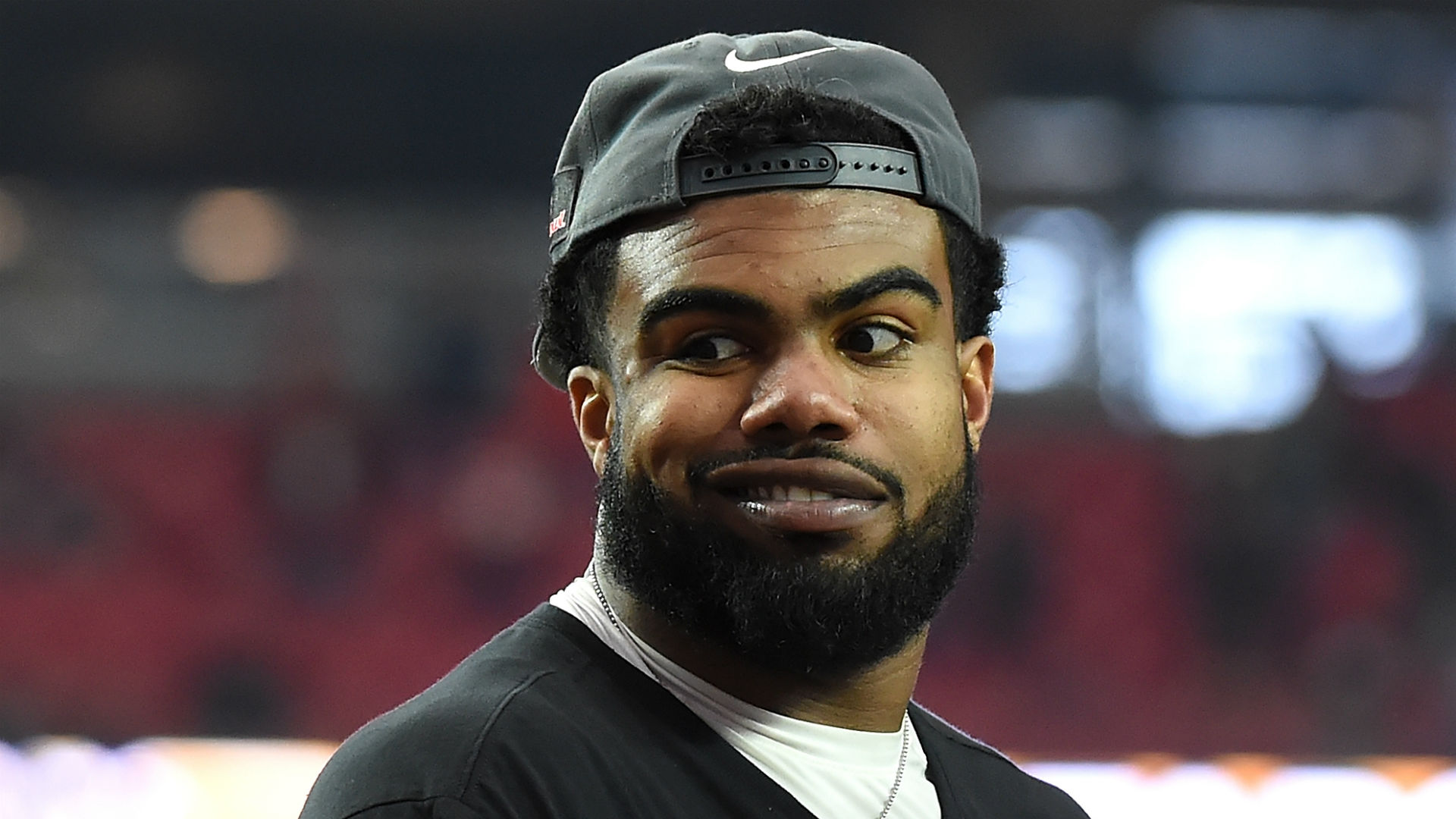
My team and I were approached by Alliance Management Group who represent Dallas Cowboy’s star Ezekiel Elliott, and they asked us if we were open to pitching them a brand identity concept and website for them. I normally wouldn’t do spec work but this was an opportunity to break that rule for the better. After grinding out a pitch, my team and I were selected to move forward with the project and together, we built a successful Brand Identity with merchandise design coupled with a custom front-end design with Shopify back-end to manage orders.
Project duration: 8 Weeks
PROJECT BASICS
REQUIREMENTS
There is only so much time during the NFL offseason (11 weeks to be exact), and Ezekiel’s management wanted to have his branded merchandise and website up just before the season started. Their priority was to launch a website that included an area to donate to his charity and sell his merchandise.
THE GOAL
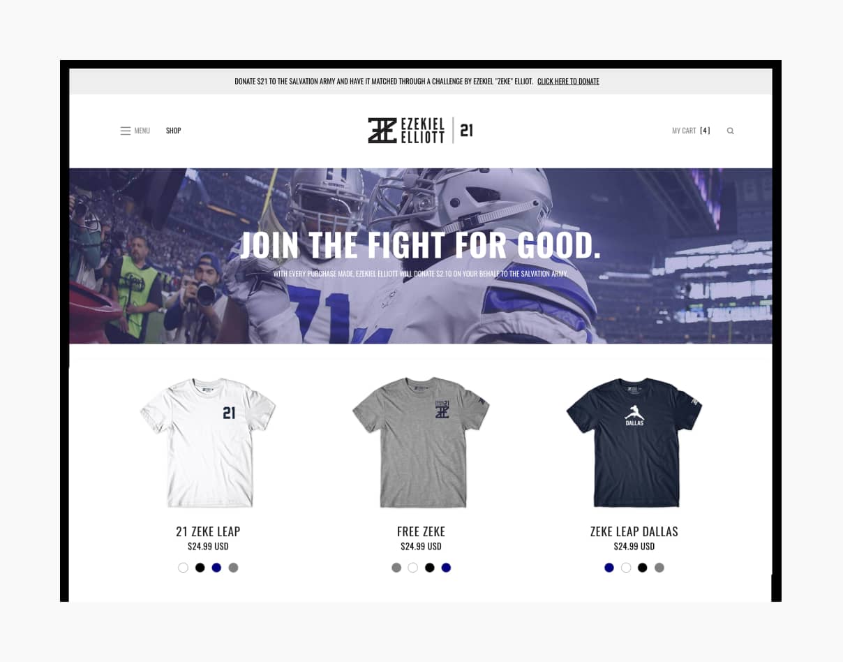
My goal was to get this shipped out in 8 weeks, which meant that our process had to be extremely tight and regimented. We chose Shopify as the e-commerce platform to manage his sales, but wanted to create something unique outside of the templates provided.
RESPONSIBILITIES
Account management, project management, creative direction, web product design, merchandise design and production.
BRAND IDENTITY DESIGN
Building the brand around Zeke
1. LOGO DESIGN:
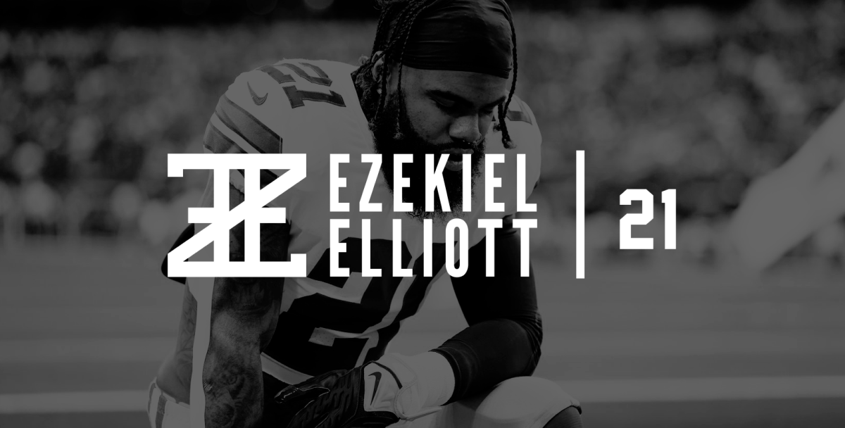
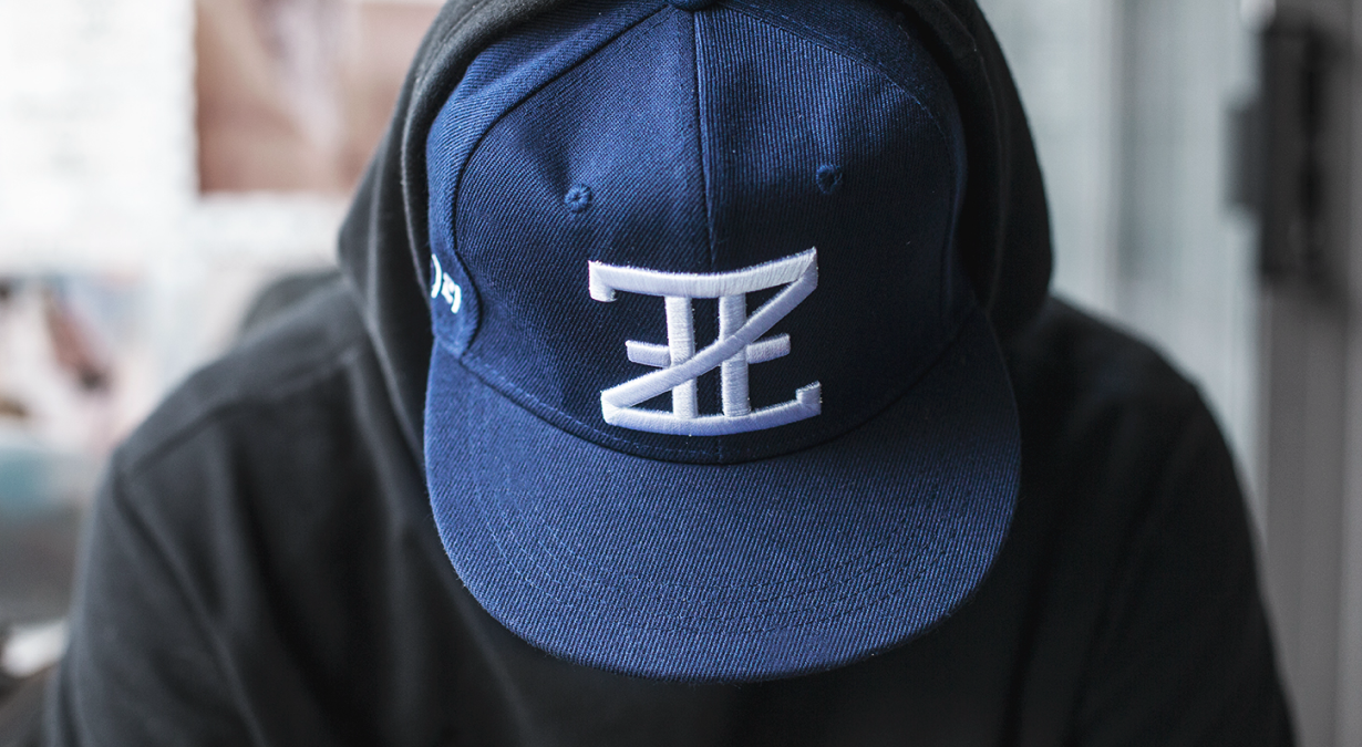
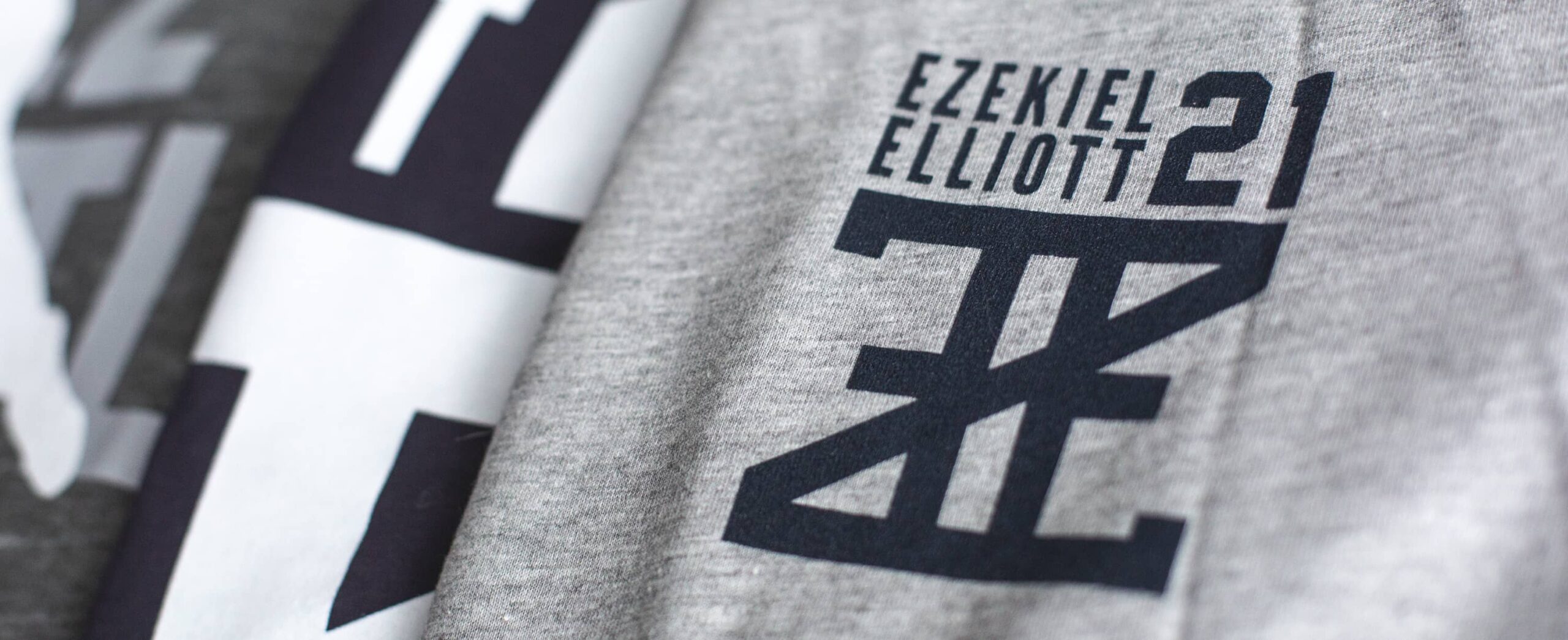
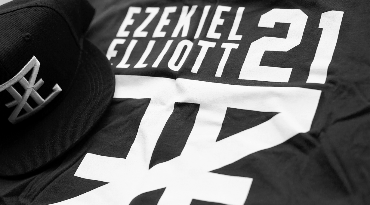
The inspiration of the logo design comes from the name's meaning, "God strengthens". The "EZE" symbol (name that his closed friend called him) is visually created to mimic Roman numerals and thus giving it a biblical look and feel that lends well to its namesake.
2. COLOUR + TYPOGRAPHY:
Zeke wanted his main brand colours to reflect the Dallas Cowboys so we went with the classic navy blue and silver colour theme and paired it with bold and tall typography that ties the whole brand together neatly.
MERCHANDISE DESIGN
Prepping for production
MERCH' PRODUCTION:
After getting approval on the brand designs, I had to move swiftly into getting the products made in time to sell on the website. I prepared mockups of each colour variation to guide the production team on graphical placement on each product. Source files were prepared for production and the final product matched everything accordingly.
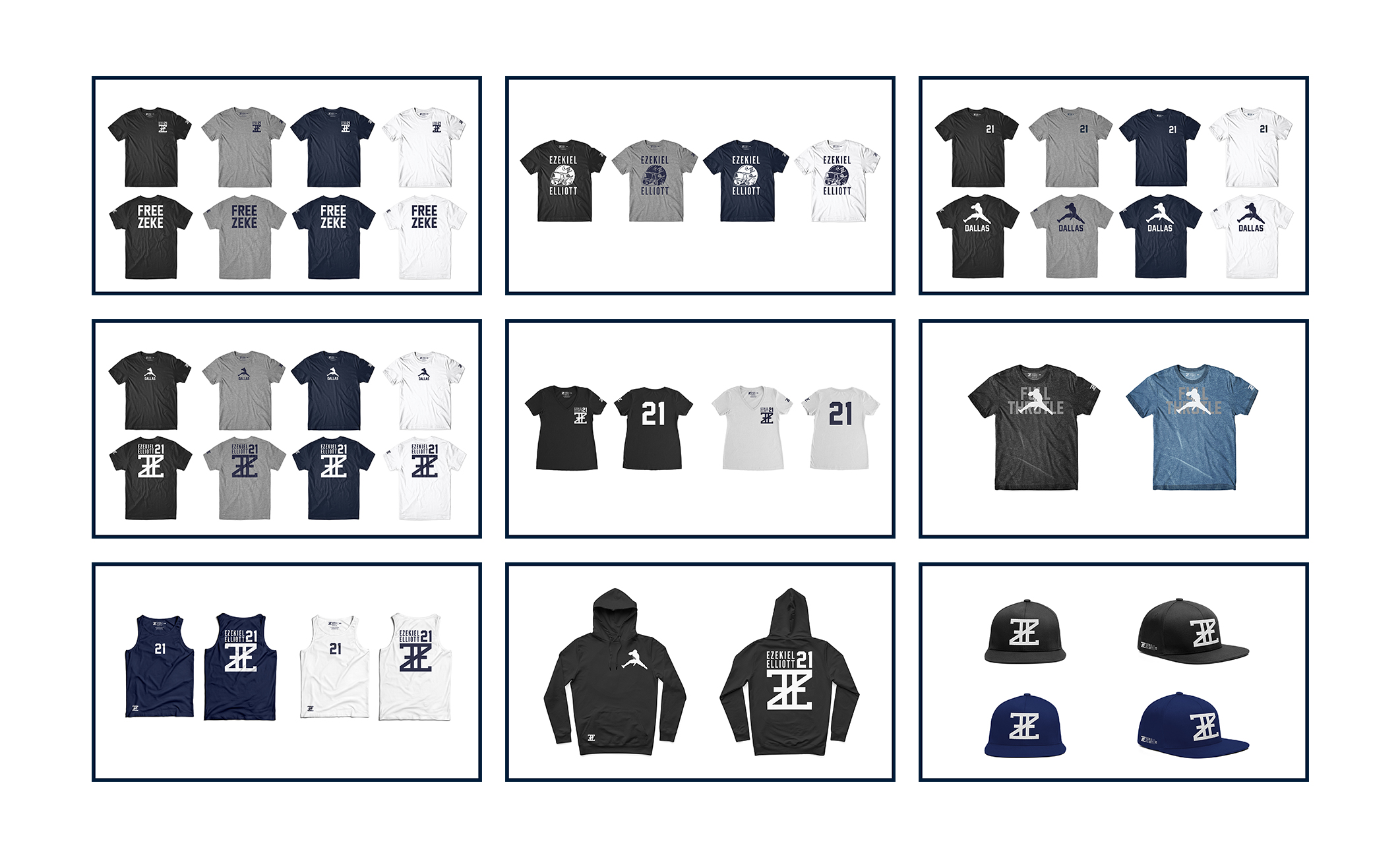
FINAL PRODUCT:
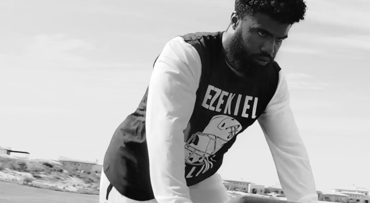
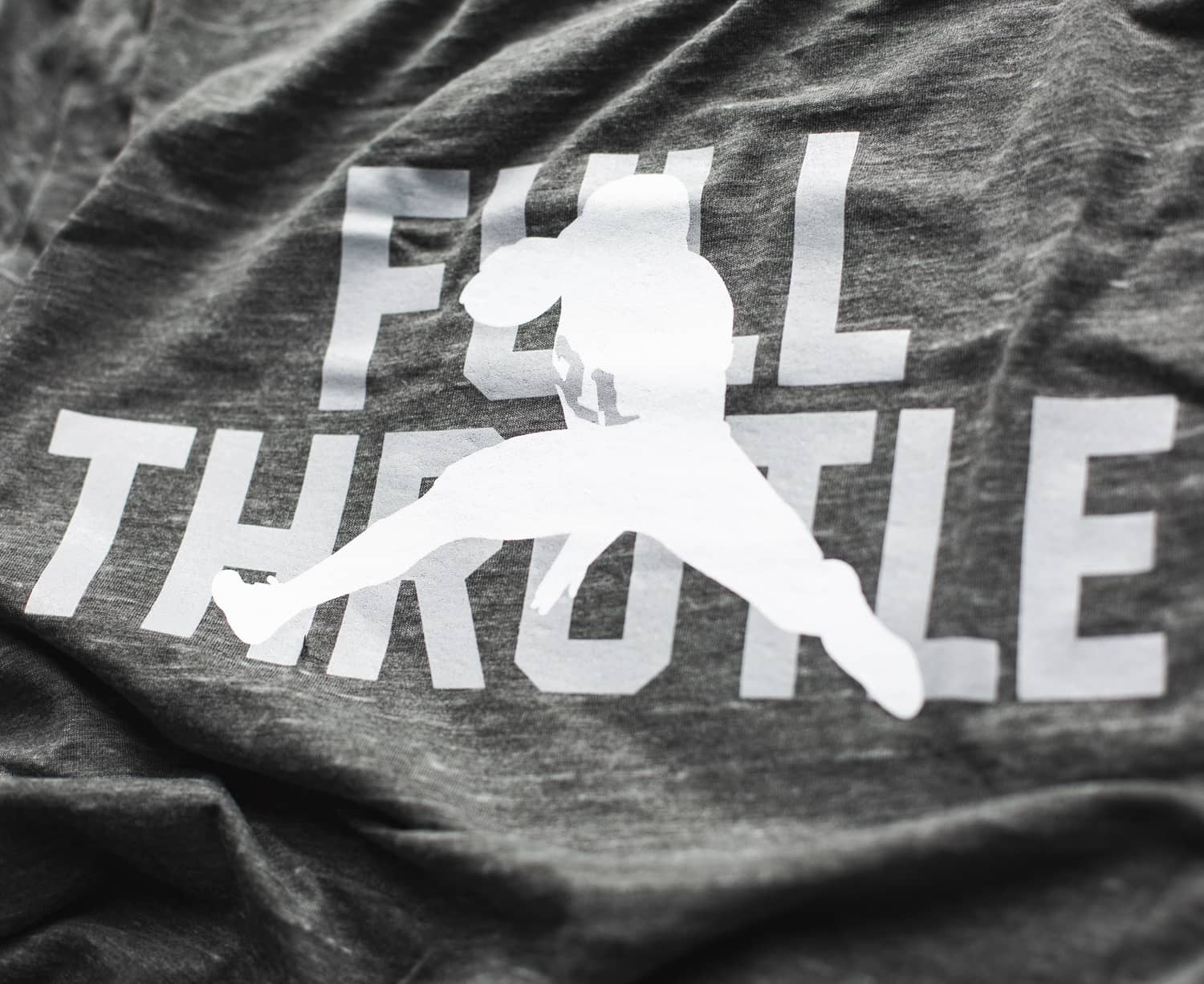
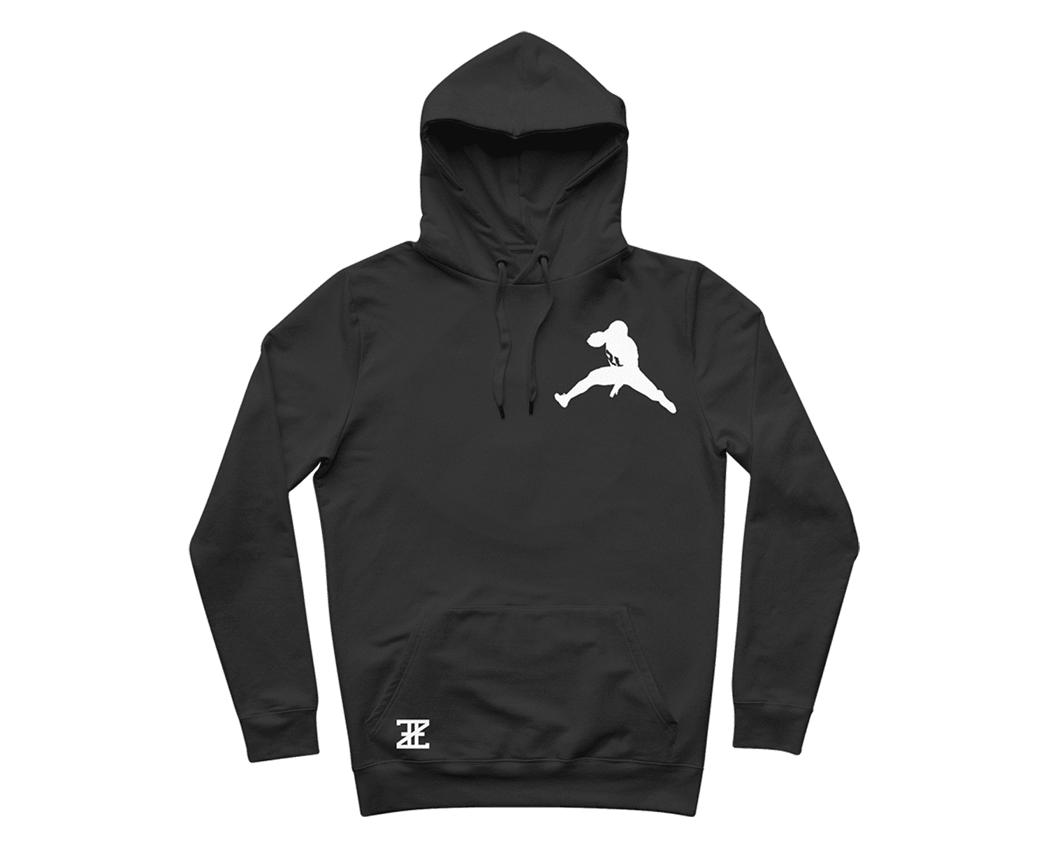
We netted out with 4 designs for mens and womens shirts/hoddies along with hats and tank tops. We highlighted two products as “black label” designs that used premium materials to produce.
CUSTOM SHOPIFY WEBSITE
Starting the design
1. PAPER WIREFRAMES
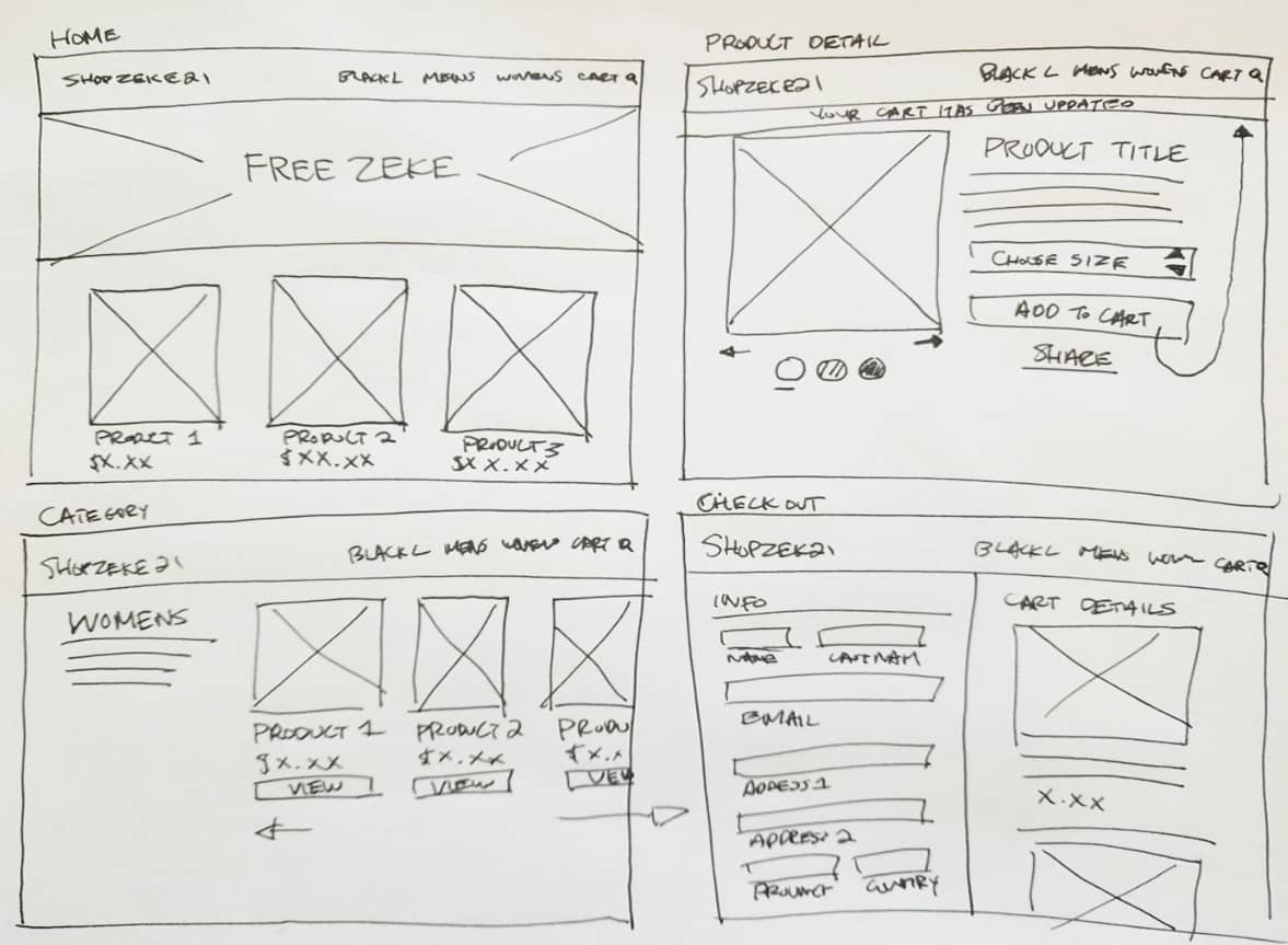
I sketched out paper wireframes for each major screen of the website, keeping the user's pain points about navigation, browsing, and shopping experience in mind.
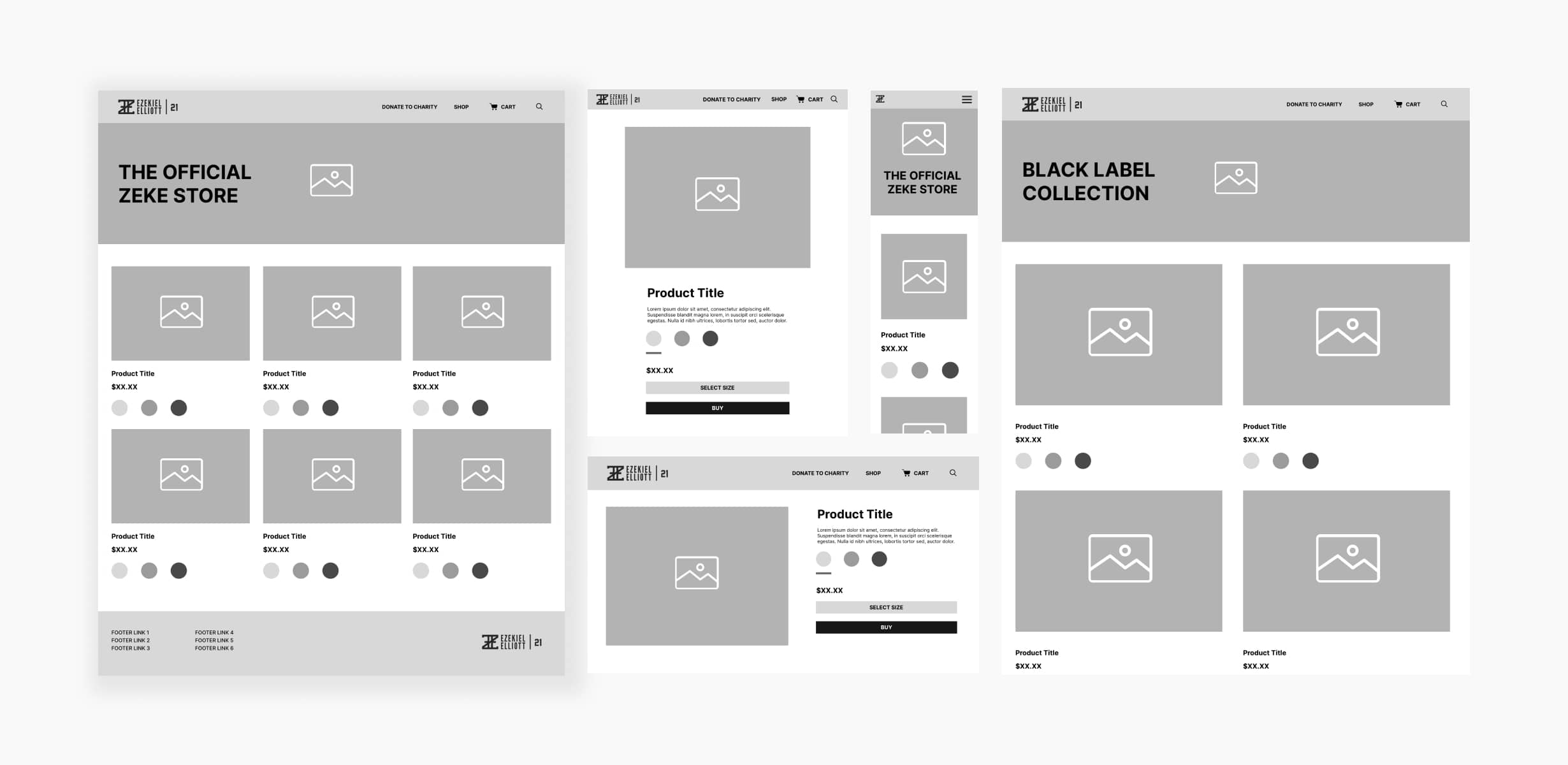
2. WIREFRAMING
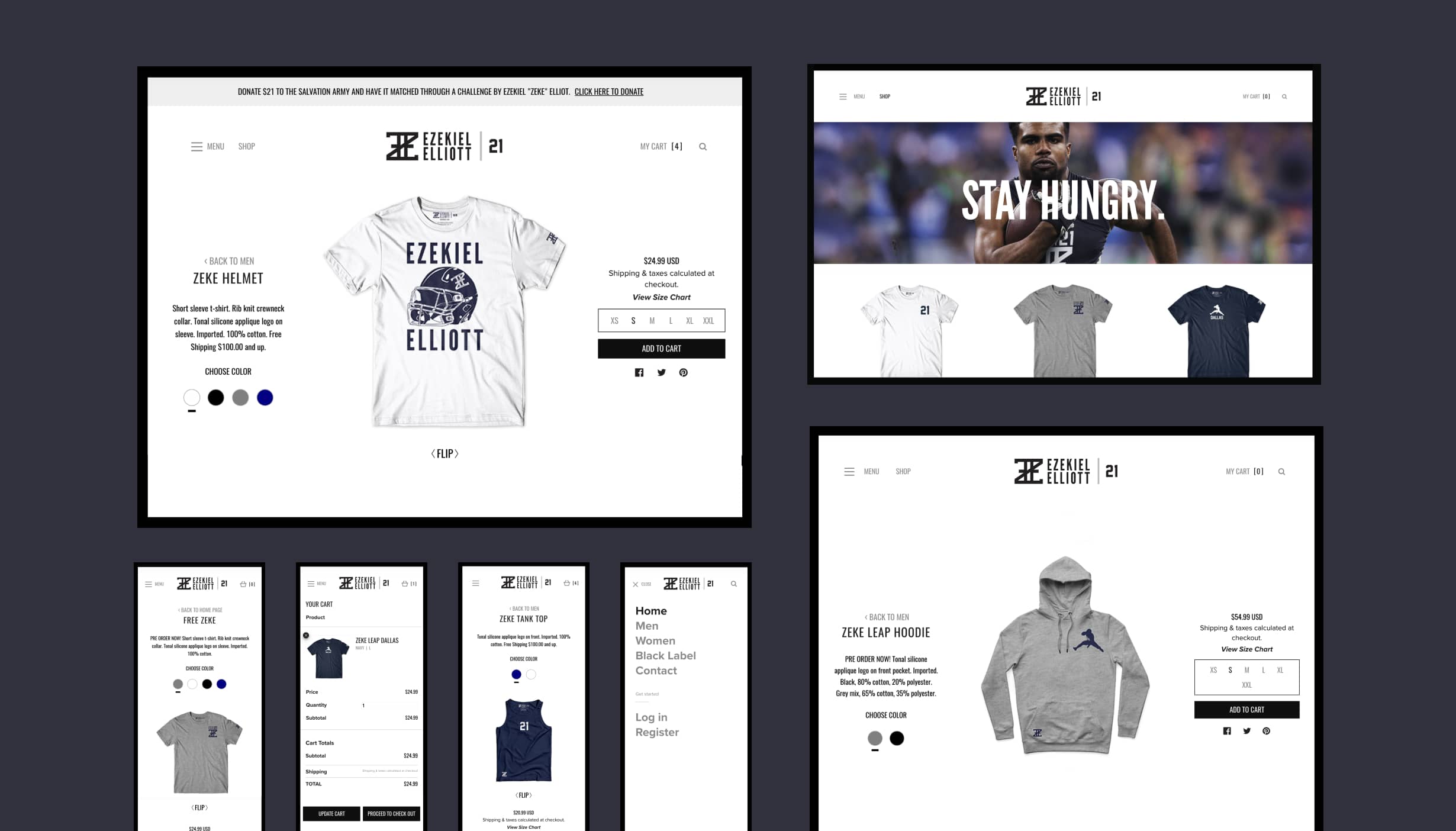
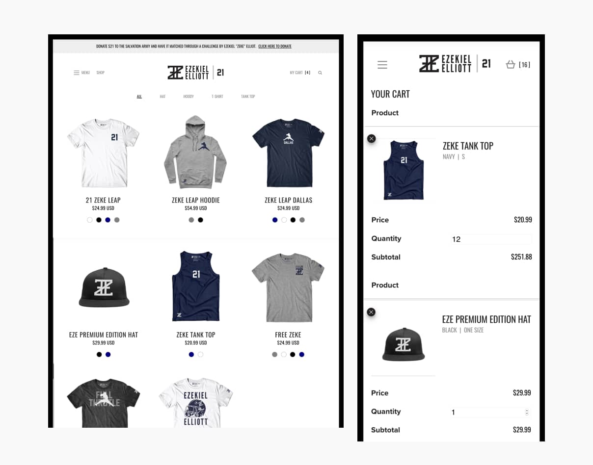
Digital wireframes made it easy to understand how the design could help fans shop for Zeke's new merch' and experience an easy check-out process. Prioritizing product imagery and creating a unique shop detail page was a key part of my strategy.
Fans will also access the site on a variety of different devices and I created designs for additional screen sizes to make sure the site would be fully responsive.
2. USABILITY FEEDBACK
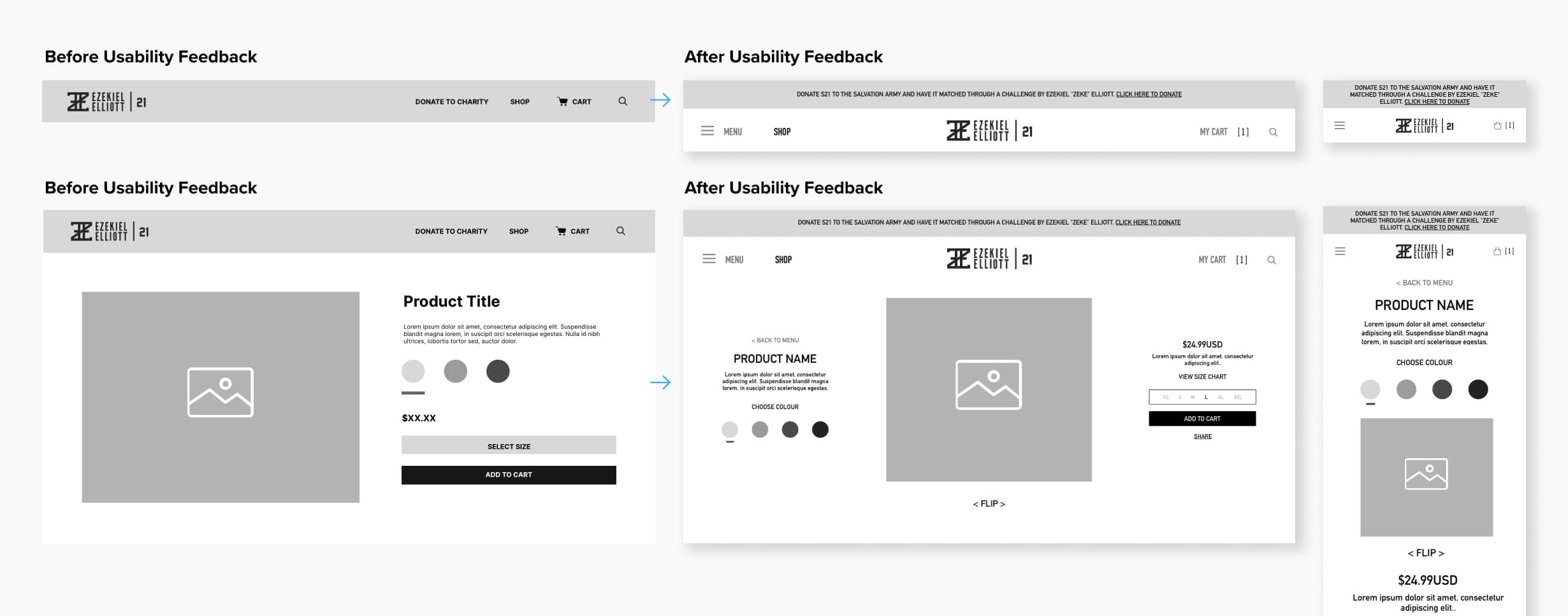
To prepare for testing, I made an invision prototype of the main pages to conduct an unmoderated usability study with 10 participants. Here are the main findings uncovered by the usability study:
A) Navigation
Users felt there were too many menu items in the navation and it was cluttered
B) Product Detail Page
Once at the product screen, users didn’t have a way to easily identify which views were "front" and "back"
C) Product Sizes
Users wanted the ability to view all the sizes available for each product right away instead of selecting it from a dropdown to check if their size was still in stock
Refining The Design
REFINED WIREFRAMES:
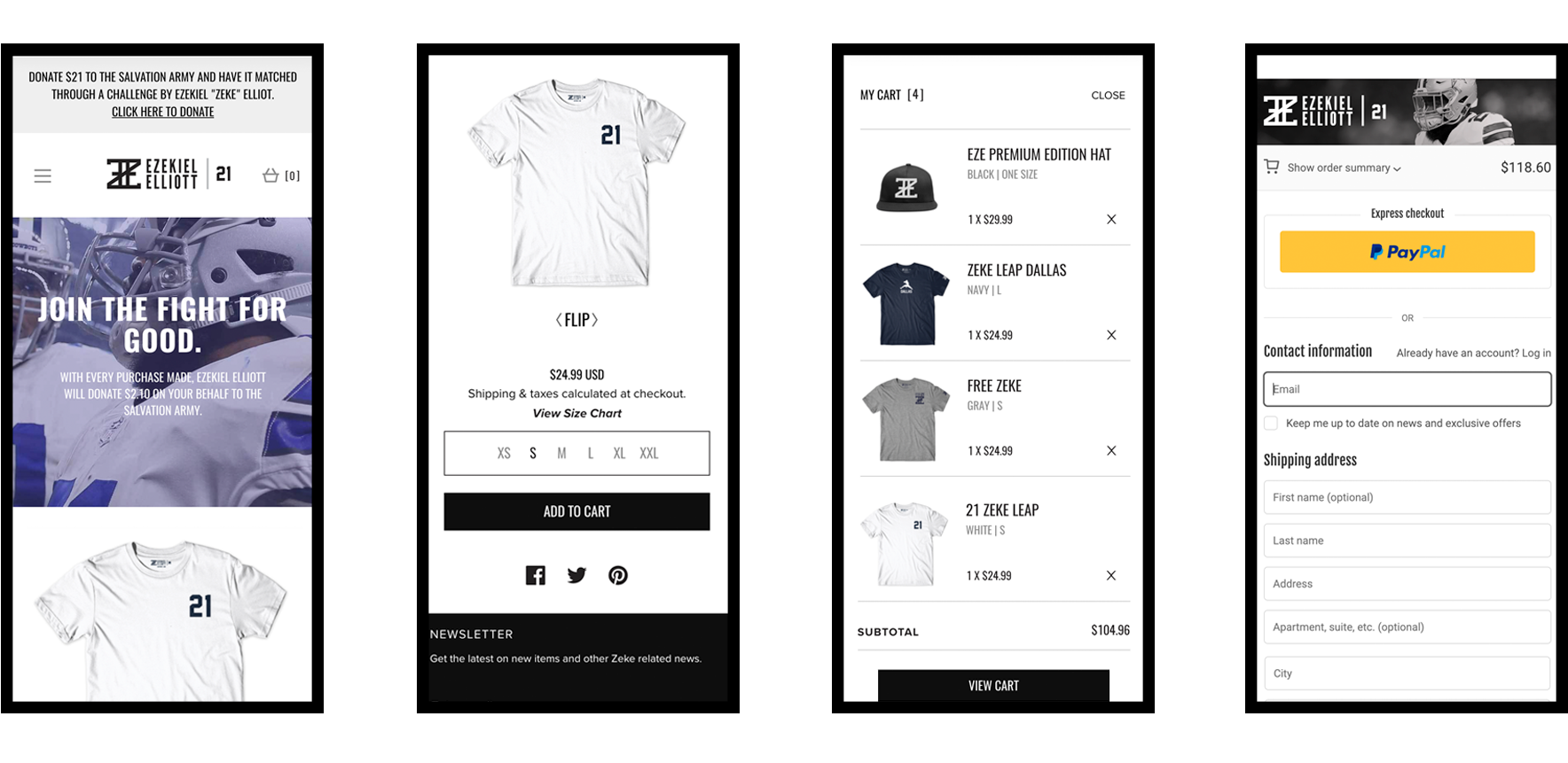
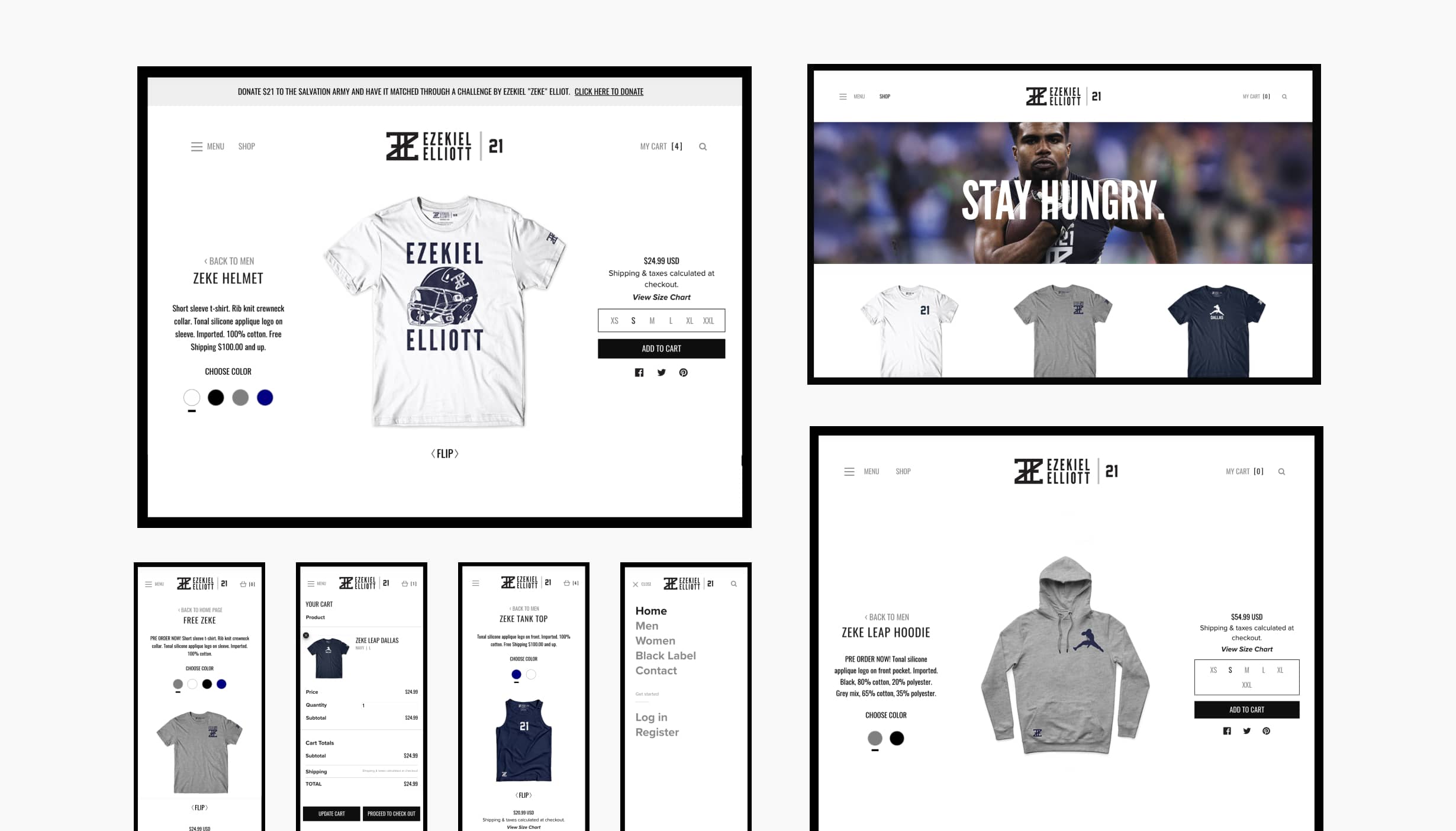
Based on the insights from the usability study, I made changes to improve the site’s navigation and product detail page experience. One of the changes I made was removing the product sizes from the dropdown and instead I laid out all the sizes viewable up-front. The sold out items are shown as crossed out as well. This allowed the fans to see which sizes were still available right away.
I also condensed the secondary navigation items into a hamburger menu (Men, Women, Black Label, Contact, etc.). This created more breathing room in the navigation and thus, visual less clutter.
To make the front/back views clear, I added a "FLIP" button to show "FRONT" and "BACK" views of the product. I also removed "DONATE TO CHARITY" from the nav and replaced it with a Promotion Bar on top.
ACCESSIBILITY CONSIDERATIONS
A) I used headings with contrasting size of text for clear visual hierarchy
B) I used high contrast rate for the colours
C) Text Resizing applied to all respective major device screen sizes
SHOPIFY BACK-END:
For this portion of the project, my team and I worked closely with our development partner, Darren Shae (Curser CEO) to integrate my custom-front-end design with Shopify's ecommerce platform. With this entire set up, we handed everything off to Alliance Management Group to operate moving forward.
SHOPIFY BACK-END:
For this portion of the project, my team and I worked closely with our development partner, Darren Shae (Curser CEO) to create a custon-front-end design paired with a solid Shopify back-end. With this entire set up, we handed everything off to Alliance Management Group to operate moving forward.

WRAPPING UP THE PROJECT
Going Forward
IMPACT:
The ShopZeke 21 campaign was shipped in time before the start of the season and saw a tremendous amount of sales with their entire inventory selling out multiple times. The success of the shop led to an extension of another season and came to a conclusion in 2020.
IMPACT:
MLSE/Playground Pros shared their new e-learning platform is exactly what they were hoping for and more. One quote from their feedback was that “This website makes our jobs easier as course instructors, we’re excited to move forward with a digital solution especially during these uncertain times”.
© MADE BY MIGHTY INC. 2016-2024